

I’m kinda bugged by this little problem. In over 70 years, with all the resources and funding that the federal government has access to, they can’t seem to visualize a comprehensible guide to good nutrition. In seven decades, five ideas have been created, funded, and distributed across America and into the impressionable minds of our schoolkids. But none of the food guides have been all that good. In fact, the most recent one, MyPlate, is borderline silly. Shouldn’t they be getting better in time, not worse?
I grew up in the ’80s and ’90s learning that there were four food groups: fruits and vegetables, milk, meat, and grains. In fact, this is what all Americans between 1956 and 1992 grew up knowing. The “Basic Four” food groups were developed as a way to simplify what the USDA had come up with earlier, and thank goodness.

1. Green and yellow vegetables;
2. Oranges, tomatoes, or grapefruit;
3. Potatoes and all other fruits and vegetables;
4. Milk and milk products
5. Meat, poultry, fish, or eggs (or dried beans, peas, nuts, or peanut butter)
6. Bread, flour, and cereals
7. Butter and fortified margarine
The somewhat odd and complex grouping of foodstuffs in the Basic 7 diagram (and the pie-chart-like design that communicated equal servings for each group) was trumped by the well-received Basic Four just 13 years later. The four food groups were, after all, easier to learn, understand, and remember. We still weren’t taught serving sizes with the Basic Four, but for thirty-six years afterwards, Americans learned, simply, that we should eat our four food groups. No diagram of the Basic Four seems to have emerged as the nation’s standard during that time period, but those of you who grew up in that era can probably remember what some of the basic diagrams looked like: a box, evenly divided into four squares, visually suggesting an equal consumption of each food group. They were simple, easy to remember, and they were widely successful. But they still said nothing about how much you should eat of each and they didn’t include other things we eat, like sugar.

But thirteen years later, the USDA got fed up with a recurring complaint: pyramids suggest a hierarchy. Why was sugar and fat on top? And, holy moly! Look at how many grains that would actually be if did the math to equate that portion of the pyramid!
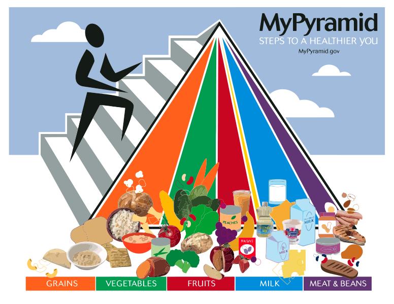
But this version was loaded with visual error as well. Nobody, it seemed, could actually tell how many grains or how many meats to eat. Was the amount of milk more or less than vegetables? Looking at MyPyramid, it was almost impossible to tell. The data that was gained in the previous version was lost in this one to a simpler pyramid design but busier, and unnecessary, foodstuff icons–which looks more like a landfill than anything worth consuming.

But this newest version is, still, visually incorrect. Besides missing out on healthy oils and sugars as some have complained, the portion sizes are still incomprehensible. Circles are used to suggest parts of a whole, like in a pie chart, but for this to work, each portion requires a unified central point. Diving the food groups into wedged portions like this is almost impossible for our minds to calculate. Worse, dairy doesn’t fit within the whole, making pie-chart calculation impossible; in fact, dairy seems to just be added onto the plate like some sort of undesirable wart–the bastard food group that may or may not be optional. And how does that little blue circle compare in quantity to the wedge of protein? Is it slightly less?
Admittedly, the MyPlate chart is attractive and it’s easy for me to see why the USDA would move to it over the previously obnoxious MyPyramid. But the simplicity of the chart makes it less than useful and the visual faux pas of the dairy and misaligned center make it less than helpful. Perhaps the next time the feds dump millions into a chart, they can look to a more comprehensible guide that doesn’t underestimate American’s ability to understand information. Hopefully we can move closer to something like what they use in Australia, the Guide to Healthy Eating, which has far more instructive value and is, actually, visually correct.
