

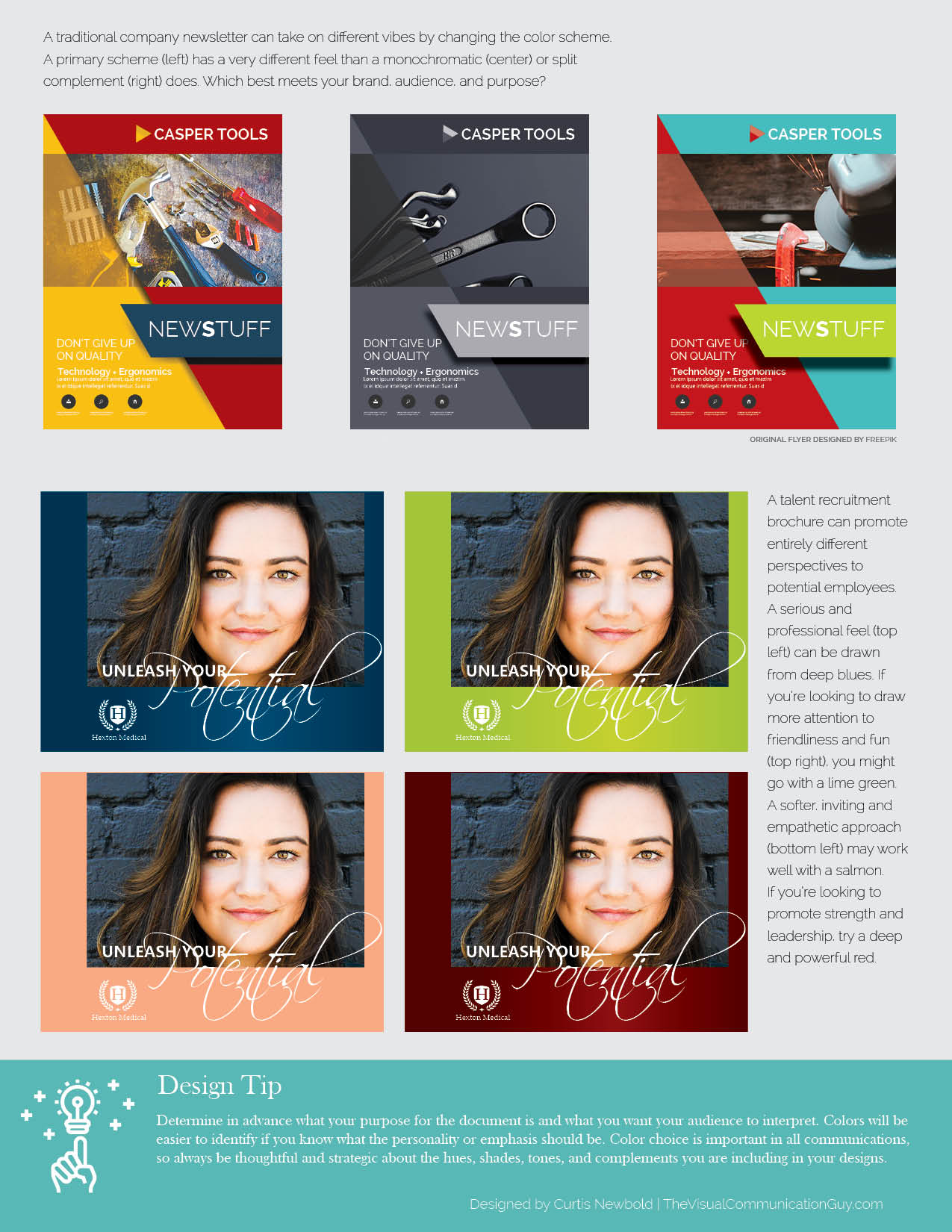
Once you have a firm grasp on common color terminology and on how the color wheel works, explore how different colors can affect the mood, emphasis, and overall effectiveness of the same content. Always be strategic about the colors you are using, as they will significantly affect how people react to, interact with, and make meaning from your information. See below the graphic for more tips on using color to affect mood.

A few tips for being conscious and strategic when applying color to your information:
Four or Fewer Is Best
In most cases, use four or fewer colors as your scheme for your entire design. Sometimes, if you use four closely analogous colors, you can use a fifth to highlight something, but generally one, two, or three colors works best.
Black and White Don’t Count (Usually)
When creating color schemes, black and white are freebies. So if you have a monochromatic color scheme, for example, you might use four shades of magenta, but you can still use black for text on white paper or white text on top of a dark magenta area. Even if you are using four colors, you can often get away with using white and black as additional colors. Do note, though, that black can clash with some colors, particularly black backgrounds with colored text.
Contrast Can Make a Big Difference
Contrast with color can happen three ways: contrasting hues; contrasting saturation, or contrasting brightness (see Rule #26). When you have two complementary colors, for example, you automatically have contrasting hues because they are opposite each other on the color wheel. When you contrast with saturation, you are making a color bright in comparison to dull. When you contrast with brightness, you are making a color bright in comparison with dark. Contrast draws attention, highlights key points, and improves readability. Plus, effective contrast is easier on people’s eyes than documents that have low contrast.
Practice Makes Perfect
Using color effectively isn’t something that comes naturally for many people. One of the best ways to improve your ability to work with color is to practice, Work with a variety of color schemes and always be conscious of how colors interact with each other and what color model from the color wheel (Rule #12) you’re trying to mimic. Pay attention to consistencies and contrasts in hues, saturation, and brightness and make sure everything is working in concert with everything else.