


Influencer marketing is one of the most effective platforms through which the brand can reach the audience in a real way at the very present time. Yet, simply having an influencer endorse your product is not enough. It is worth all the effort. However, when it comes to capitalizing on influencer analytics, the next-more important are those data-driven reflections-revealing what influencer really true reach, engagement, and effectiveness do to your brand. Well, present visually appealing so that better conveyance has taken place in a decision-making context.
Why Is Influencer Metrics Important
Key metrics for influencer measurement include
- Engagement rate: The proportionate element of fan/viewership that connects with an influencer’s content.
- Reach and impressions: How many people ever see the content, and how many times.
- Audience demographics: Accumulation of data in terms of age, place, and interests referring to the followers.
- Conversion Rates: Actions taken by X no of followers (i.e., clicks, purchases, sign-ups).
- Helps a marketer to know whether that particular celebrity has taken any interest in the brand and how truly effective the celebrity’s campaigns are.
Data Visualization for Better Perception
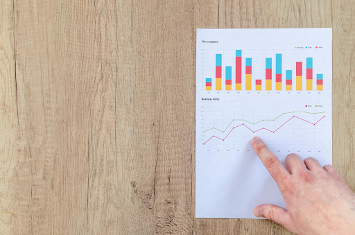
Raw data can make a reader’s mind dizzy and often lacks clear meaning. Very clear examples of findings must be told using visual storytelling. Influencer analytics should be represented through engaging visuals that simplify complex data, making it easier to extract insights. Employ interesting representations, as well as easy ways to comprehend influencer analytics, such as interactive dashboards, infographics, and heat maps that highlight key performance metrics in an intuitive way.
1. Interactive Dashboards for Real-Time Insights
A dashboard well designed would help in incorporating the specific key performance metrics regarding an influencer at a glance. Such tools include Google Data Studio, Tableau, or an influencer marketing platform to help create real-time interactive reports with maximum usability in campaign achievement tracking.
2. Infographics for a Supposedly Quick Comparison
Comparing various influencers? Then you will probably use an infographic side by side that shows engagement rates, audience demographics, and post performance, thus effectively identifying yourself with the influencer that fits your brand. Color coding really makes it even better.
3. Use Heat Maps to Track Engagement Patterns
Heat maps will show you where an influencer most of his audience engages-whether on Instagram Stories, YouTube Videos, or Blogs. Such data then refines the content strategies of marketers and optimizes the avenues for ad placements.
4. Trend Graph for Indicating Growth Over Time
A line graph depicting the growth-in influence of a person as a function of follows, engagement trends, and even conversion figures can indicate long-term performance, thus making it easier to spot those influencers with sustained credibility instead of flashiness immediately.
Actualizing the Data in Marketing Strategy
The brand can perform such initiatives with properly visualized analytics:
Finding those influencers who fit with their true brand value and who have an engaging audience. Knowing what kind of posts or formats (videos, carousels, stories) are most successful would optimize the content strategy.
Audience refinement according to demographic and engagement behavior.
Effective ROI measurements through conversion counting and revenue from sales generated by influencer collaborations.
Final Words
The analysis of influencer performance is critical and helps along with data-driven marketing decisions. Still, the numbers alone cannot suffice-the best use of visual methods makes them actionable, persuasive, and accessible to marketing teams. Contracts for rigorous and careful analysis of influencer performance produce dashboards, infographics, and trend graphs, which will change raw data into a powerful storytelling machine that drives engagement and results.