


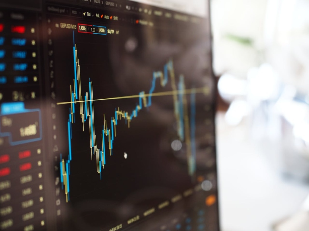
If you’ve ever taken even a passing glance at financial market analysis, you’ve probably seen a candlestick chart. With their colorful blocks and thin lines stretching above and below, candlesticks can look intimidating at first. But once you understand the logic behind them, they become one of the most useful tools for interpreting market behavior.
Candlestick charts are not just for day traders glued to their screens. They are valuable for investors, business professionals, and even students learning how markets reflect human psychology. Whether you’re analyzing Apple’s stock performance, comparing currencies, or just exploring how data visualization works, candlesticks provide more nuance than a simple line chart.
Why Candlesticks Matter
The anatomy of a candlestick allows you to see four critical pieces of information at once:
- Open Price: Where the security started trading in a given timeframe.
- Close Price: Where it finished.
- High Price: The top of the wick shows the peak price.
- Low Price: The bottom of the wick shows the lowest point.
The body of the candle (the block between open and close) tells you whether the session was bullish or bearish. If the close is higher than the open, the candle is often green or white, signaling upward momentum. If the close is lower, it’s typically red or black, signaling downward pressure.
This visual shorthand makes candlestick charts especially powerful compared to simple line charts, which only track closing prices. To see how this plays out in practice, you can explore a live example through AAPL’s stock performance.
Resources like Axi’s page make it easy to buy Apple CFD and follow candlestick charts in real time, giving learners a way to connect the theory of candlestick patterns with real market data.
Anatomy in Detail
Let’s break the candlestick down more closely:
- Body: The rectangular part of the candle. A long body means a strong directional move; a short body means the price stayed relatively stable.
- Wicks or Shadows: The thin lines above and below the body. Long wicks show volatility, while short wicks suggest the market stayed close to the open and close.
- Color: Convention matters here. Green (or white) is bullish; red (or black) is bearish.
A single candlestick might summarize one minute, one day, or one month, depending on your chart’s timeframe. This flexibility is key. A daily chart might show Apple stock steadily climbing, while a one-minute chart reveals volatile back-and-forth action within the same session.
Candlesticks vs. Other Chart Types
How do candlesticks compare with other popular chart formats?
- Line Charts: Simple, but they only show closing prices. Good for long-term trends, less useful for intraday decision-making.
- OHLC Charts (Open, High, Low, Close): These bar charts also show the four data points but lack the visual clarity of colored candlesticks.
- Candlestick Charts: Offer the same four points as OHLC, but with instant visual cues that make patterns easier to spot.
In other words, candlesticks sit in the sweet spot between information density and readability.
When to Use Candlestick Charts
So, when does a candlestick chart add value? Here are some scenarios:
- Identifying Market Sentiment: Is momentum with buyers or sellers? Candles reveal that at a glance.
- Spotting Reversals: Certain formations, like doji or hammer candles, may hint at upcoming shifts (though they’re not guarantees).
- Short-Term Trading: Candles are invaluable for intraday strategies that depend on precise entry and exit points.
- Teaching and Learning: Because candlesticks show human behavior in visual form, they’re effective tools for explaining supply and demand dynamics to students or new investors.
For long-term business analysis or broad strategy, line charts might suffice. But when you want to understand the texture of price action, candlesticks are the go-to.
Patterns and Caveats
Candlesticks often form recognizable patterns that traders use to inform their decisions. Some well-known ones include:
- Doji: When open and close are nearly identical, suggesting indecision.
- Hammer: A small body with a long lower wick, sometimes interpreted as a bullish reversal.
- Engulfing patterns: When one candle fully covers the body of the previous one, signaling a shift in sentiment.
However, it’s important to remember that candlestick patterns are not crystal balls. They should always be interpreted within a broader context that includes:
- Market news and fundamentals
- Volume trends
- Broader technical indicators like moving averages
Used in isolation, candlesticks can lead to overconfidence. Used wisely, they provide clarity on what’s happening right now in the market.
Timeframe Considerations
Another caveat is that candlestick meaning changes with the timeframe:
- Short Timeframes: Great for traders, but noisy for long-term investors.
- Daily or Weekly Candles: Offer a balance between detail and big-picture trend.
- Monthly Candles: Smooth out short-term volatility, useful for portfolio analysis.
A “bullish hammer” on a one-minute chart may mean little, while the same shape on a weekly chart might hold more significance. Matching your timeframe to your goals is crucial.
Final Thoughts
Candlestick charts strike a balance between depth and readability, offering traders and learners a window into the psychology of the market. By showing open, close, high, and low in a single visual unit, they pack a wealth of information into each session.
Compared to line charts, candlesticks help you interpret not just where prices have been, but how buyers and sellers battled along the way. Whether you’re trading actively, evaluating investment strategies, or teaching finance concepts, they provide a versatile toolkit.
At the same time, remember candlesticks are not predictive magic. They work best when combined with broader analysis and a clear sense of your goals. Use them as a guide, not a guarantee, and you’ll gain sharper insights into how markets move.