


Pick up two business cards: a heavy one with raised lettering and metallic components and a flimsy one printed on an at-home printer. Sure, they’re the same on paper from a data perspective. But from a cognitive perspective, they operate on two different brain levels. One represents professionalism and success. The other gets tossed or forgotten.
It’s not superficial thinking; it’s human perception. Humans have automatic means of association with the physical qualities of materials, which renders a judgment prior to any conscious cognition or evaluation. Therefore, this explains how and why some brands feel the need to spend extra for packaging and others rely on basic offerings.
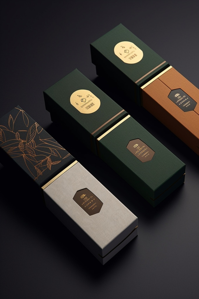
We Don’t Realize How Much Touch Matters
Touch connects with the emotional processing centers of our brains. When we feel something heavy or textured or substantial, we appreciate it; we feel its importance. When it’s flimsy or paper thin or light as air, it’s cheap and disposable.
Haptic perception has been studied; it’s empirically measurable. Products that feel heavier packaging arrive at higher quality ratings despite being identical to those packaged in less heavy solutions. We also are more willing to spend more for products packaged in additional hefty boxes (even though the heft is merely the packaging and not the contents therein).
But this happens unconsciously. When one picks up a business card, they do not say to themselves “this heavy stock means this person is upper-middle class.” Instead, they feel it, and the weight precedes their evaluation in making a decision about the person/company.
Furthermore, texture adds appeal and associations that have nothing to do with weight: glossy is modern; matte is artisanal; rough edges are rustic; soft-touch is inviting. Each signifies something relative to perception.
The Visual Component Adds More
In addition to touch, visual enhancement offers another level of perceived value (for nonessential materials). Matte vs. shiny; dull vs. metallic – anything that contrasts the average element increases physical status. And if it’s something regularly seen by consumers, it makes them think that the company invested more time and energy into even the marketing aspects.
Brands that employ a hot foil stamping machine to bring metallic elements into play are relying on centuries-old connections – gold/silver are associated with wealth; even if a brand can only render foil presentation on cardstock or paper, the implication is that people equate richness with premium pricing for attitudinal benefit.
Additionally, even if the business card itself has a similar piece, once it’s all one dimension and color, it blends into the rest of them; if it has raised lettering or metallic components, it stands out in a different sense – an inability to be forgotten.
Color Associations Add Meaning
Color associations with packaging produce emotional responses. For example, black packaging seems classy and high-end while white feels clean and simplistic; earthy jewel tones bring about rich connections. Gold is fancy, silver is modern and techy whereas rose gold has a contemporary twist while copper gives an artisan feel.
But more significantly, colors are considered premium when they’re attached to quality materials. Gold ink on cheap paper looks gaudy. Gold foil on heavyweight cardstock looks expensive; as such, quality reinforces what a brand wants to deliver.
The Unboxing Experience
A big part of what premium packaging provides is something called the unboxing experience – that emotional journey people take when opening up a box and seeing what’s inside. Brands that capitalize on this aren’t just providing a sense of protection for products – they’re providing an emotional journey that fosters how people feel about the product before they’ve even taken possession.
Layers create this. The need to unwrap tissue paper or peel back tape or open a lid all encourage anticipation as opposed to just ripping open a basic plastic bag; one represents a gift, the other, a transaction.
Thus, when one has a sturdy box with soft-touch magnetic closure where the top is embossed with a logo or a foiled detail, expectations arise before one even approaches the product inside. Interior wrapping helps solidify this as valuable and worth the purchase.
When Premium Materials Don’t Fit
However, not every brand needs this luxury element – for value-based reasons, basic packaging works best – it shows that despite what someone might think, the bottom line is clear, and for discount retailers or low-value companies to utilise higher end materials and signalling in their branding can feel dishonest.
Therefore, brand positioning matters most relative to material selection – the two must align. For brands focused on value, basic works best (meaning no additional cost). For luxury brands – or those that position as such – this is table stakes.
Budget also plays a role. Small businesses may not have the resources. Clean and simple options can seem like quality without breaking the bank. The goal is not to poorly present the product but also not use materials that a client would never expect to be paying extra for.
The Memory Effect
Perhaps most significantly, what premium materials can do for an enterprise is retain memory. Standard marketing material goes in one ear (or hand) and out the other but premium cards get kept, shown off, compared months later and held up for judgement against new products and services.
People note things that are valuable. When something is relevant in substance (physical quality), it deserves keeping. Premium options make better memories (positive connections) which augment what people remember better than neutral ones.
Perceived Value vs Actual Costs
Finally, perceived value increases more than actual costs of premium materials. It may cost an extra dollar per unit for upgraded packaging but to people it’s worth $10-20 more.
Where ROI comes into play with smart brands is when this mathematical operation works because perceived value matches a current price point that either satisfies clients or positions them better than before.
Testing reveals this – we can try out various prices until we find customer response/willingness to pay – but often, it’s the mid-tier option that has the right level of value added alongside the price tag that people are happiest with.
Making a Decision
At the end of the day, it’s brand strategy that helps determine real need based on niche – luxury brands have no choice but to invest while mass-market and potential small businesses exist on either end of a sliding scale.
Therefore, to understand better, knowing how different materials communicate different ideas which align with brand goals is key.