


Your resume’s layout could be making it hard to scan, and a clean structure helps employers see what they need to notice first. Apparently, recruiters spend an average of just 7.4 seconds on an initial resume screen, which means formatting directly affects whether your qualifications get seen at all.
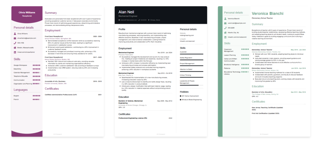
The good news is that all you need is a readable design, and CVwizard’s resume templates can be a very useful starting point. Once you understand the anatomy of a good resume, small formatting choices start doing a lot of heavy lifting. Let’s see what those choices are.
1. Put your strongest information where the eye lands first
Most recruiters scan for signals like a job title, company name, dates, section headers, and recent experience. That is why your resume should make those elements easy to find at a glance.
A strong layout puts your name and contact details at the top, followed by a short summary or headline if it adds value. After that, your recent and relevant experience should appear before anything less important. If you bury your best material under a long profile, a block of skills, or an oversized design element, you force the reader to work harder than they want to.
2. Choose one readable font and stop shrinking the text
One of the fastest ways to make a resume harder to read is trying to cram too much information into too little space.
You do not need to get creative. Readability wins, so an easy-to-read font and 10- to 12-point text is the usual sweet spot for body copy.
If your resume only fits when everything is reduced to near-microscopic size, the answer is to cut older, less relevant material, not to punish the reader.
3. Use white space like a navigation tool
On a resume, white space acts like a set of visual pauses that help each section stand on its own. Without it, everything runs together, resulting in a dense look, even when the content is strong.
Use spacing to create balance between headings and body text. The anatomy of a good resume also involves side margins of no less than 0.75 inches and top and bottom margins of no more than 0.5 inches, so the page stays readable without feeling cramped.
A little breathing room helps employers scan faster and makes your resume look more confident, so every section should look distinct before anyone reads a single word.
4. Replace dense paragraphs with outcome-led bullet points
Long paragraphs are one of the biggest readability killers on resumes, as they hide your achievements and make your experience feel generic.
Bullet points work better because they break information into manageable pieces. Hiring professionals often read dozens of resumes a day and appreciate information that is organized and easy to read.
The key is to make each bullet earn its place. If they all sound vague, the layout cannot save the situation. Keep bullets specific and focused on what changed because of your work.
5. Make headings, dates, and alignment consistent
When headings shift styles, dates jump around, bullets use different indentation, or text alignment changes from section to section, the resume feels less polished.
That does not mean every line has to look identical, but the pattern should make sense. If dates are right-aligned, keep them right-aligned throughout, and if section headings are in all caps, do not switch to title case halfway down the page.
Think of it this way: formatting should help the reader predict where they can find certain types of information. Once they subconsciously understand the pattern, they can scan faster, which is exactly what you want.
6. Use plain language and cut decorative extras
Word choice affects readability, too, so a resume can look clean and still feel hard to read if the language is bloated.
Clear wording and plain language let the recruiter process your value quickly. Familiar terms and direct phrasing usually outperform jargon and buzzwords. “Spearheaded cross-functional leadership initiatives” may sound fancy, but “led a five-person team” is much more effective.
The modern reality also means that your resume is often parsed by software before any person sees it, so readability and clean structure are practical advantages in that sense as well. Jobscan’s 2025 ATS report found a detectable applicant tracking system on 97.8% of Fortune 500 career pages.

That does not necessarily mean writing for robots. However, if a formatting choice looks clever but gets in the way of clarity, the smart choice is to cut it more often than not.
Final thoughts
The best resume formatting usually looks simple from the outside, and that’s precisely the point. A readable resume does not ask the employer to interpret your layout before they can understand your experience.
If you focus on these six things, you will already be ahead of a huge share of applicants simply by way of restraint. And in a hiring environment where recruiters scan quickly, and each opening can attract dozens of applications, restraint is a competitive advantage.