


Have you ever gone into a store and just knew which brand you were going to choose?
That’s not an accident. The difference between a trendy food brand that explodes and one that fades into the shelf background comes down to a handful of design decisions most founders get completely wrong.
Tiny choices like:
- The colours on the packaging
- The fonts on the menu board
- The layout of the physical store
The thing is… food is BIG business. A great concept today, can become a cult classic tomorrow. But only if the design is doing all the heavy lifting.
Let’s get into it…
What you’ll discover:
- Why Design Is The Real Product
- The 5 Design Decisions That Make Or Break A Food Brand
- Why Most Food Brands Get Forgotten
- Turning Design Into A Health Food Franchise Opportunity
Why Design Is The Real Product
Here’s a question… Why do some health food brands have lines out the door while others sit empty?
It’s not always the food.
Consumers form an opinion on whether they like a brand before they even taste the product. Ipsos conducted a global consumer survey that revealed 72% of consumers said product packaging design plays an important role in their purchasing decisions. That’s a big number.
Think about that for a second…
3 out of 4 customers make a purchase based on how something looks before they have tried it. If your design is forgettable, you are losing the sale before they read the ingredients.
Design is the first conversation your brand has with the customer.
And the brands winning right now understand that.
The 5 Design Decisions That Make Or Break A Food Brand
Okay, so design matters. But which design decisions matter the most?
After working with dozens of food brands over the years, the same 5 decisions keep separating winners from those that are forgotten. Get these right and your brand will be in a great position as one of the best smoothie franchises available (or any health food franchise opportunity being built out).
Let’s break each one down.
1. Colour Psychology
Colour is the first thing your customer sees.
Our senses make colour the most important element to consider, taking up 80% over shape. Your users don’t care what your business is called. They just want to know “Where do I go from here?” Colour is part of the immediate personality of your UI. It tells your users who to trust, where to click, what to buy. Pick the wrong colours and you’re fighting an uphill battle from day one.
Here’s what brands need to think about:
- Green signals fresh, natural, healthy
- Warm colours (red, orange, yellow) drive appetite
- Cool colours (blue, white) signal cleanliness
- Black and gold signal premium
The majority of failed food brands choose their colours based on the Founder’s preference. Successful brands choose colours based on the Customer’s Response.
Big difference.
2. Typography That Actually Reads
Fonts are sneaky. People don’t notice good fonts but they definitely notice bad ones.
Your typography needs to be:
- Easy to read from across the room
- On-brand (playful brand = playful font)
- Consistent across every touchpoint
If your menu board uses one font, your cups use another and your Instagram uses a third… your customer’s brain gets confused. And a confused customer doesn’t buy.
3. Packaging That Tells A Story
Packaging is your silent salesperson. It works 24/7 whether you’re there or not.
Great food brand packaging does 3 things:
- Catches the eye: grabs attention on a shelf or in a hand.
- Tells the story: communicates what the brand stands for.
- Feels premium: makes the customer feel good about their choice.
Nail all three and you’re ahead of 90% of the market.
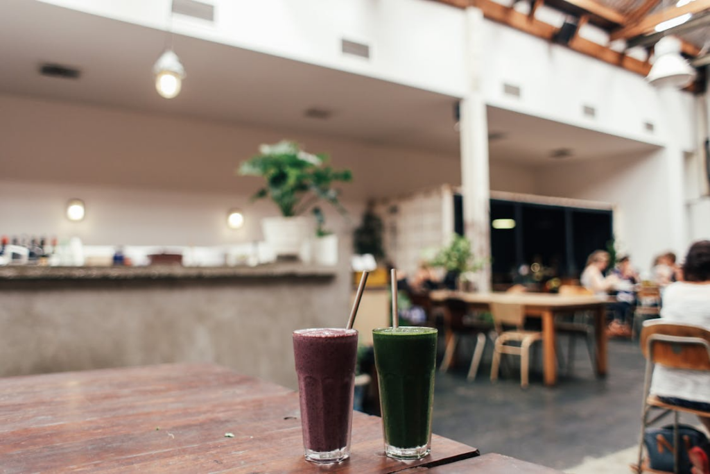
4. Physical Store Design
This one is massive for brick-and-mortar food brands.
Your store is a 3D billboard. Every square foot is working for you… or against you. Consider:
- Lighting (bright and fresh? or warm and cosy?)
- Materials (wood, metal, concrete all tell different stories)
- Flow (can a customer order in under 2 minutes?)
- Instagram-ability (is there a spot people want to photograph?)
That last one is huge. If you have no where to take pictures, then you are leaving free advertising on the table every single day.
5. Digital Design Consistency
Your website, app and social media need to match your physical brand.
Here’s why this matters:
Your customers are vetting you on their phones before they ever set foot in your door. If your Instagram looks high-end but your website looks like its from 2010…. you have a trust issue.
Consistency builds trust. Trust drives sales. Simple as that.
Why Most Food Brands Get Forgotten
Okay, so now you understand the 5 design decisions. But then why do so many food brands still remain forgotten?
The short answer: most food brands try to be everything to everyone.
They want to be trendy AND traditional. Premium AND affordable. Healthy AND indulgent. So their design ends up a watered-down mess that doesn’t excite anybody.
Forgettable brands usually have:
- Generic colour schemes (beige, white, grey)
- Stock photography everywhere
- Copycat logos from competitors
- Cluttered packaging with too much text
- No clear point of view
Contrast that with the hip brands exploding now. They choose a direction. They stand for something.
And that commitment is what makes them memorable.
Turning Design Into A Health Food Franchise Opportunity
The health food space is one of the biggest opportunities right now.
The global health and wellness foods market is expected to increase from USD 1,020.3 billion in 2025 to around USD 2,508.3 billion by 2035 at a CAGR of 9.4%. That’s a market that will more than double in 10 years.
But here’s the catch…
Every week there’s a new brand of health foods hitting the shelves. Which means design is no longer a luxury. It’s the only way to stand out.
If you’re thinking about getting into the space, ask yourself:
- Does your brand have a clear visual identity?
- Would someone recognise your packaging from across a room?
- Is your store worth photographing?
- Are your digital touchpoints consistent?
If you can’t answer “yes” to all of these, there’s work to do.
Final Thoughts
Design is not decoration. Design is the product.
Food brands that go boom approach package design like a deadly serious game of Battleships. They select colours with intention, they choose fonts with intent, they design stores with design and they package products with precision.
Nothing is an accident.
To recap, the 5 decisions that separate trendy food brands from forgotten ones are:
- Colour psychology
- Typography
- Packaging
- Physical store design
- Digital consistency
Master these and you’ll be leagues ahead of the crowd. Neglect them and you’ll be another lost voice in the noise.
The good news? Design is a lever you can pull today. It doesn’t require more money or more time — just better decisions.
Now go make them.