


Most web accessibility failures begin with a design decision, not a line of code. Color choices, typography, layout hierarchy, and image use all create or remove barriers before a developer writes a single line. This post covers the design decisions that cause the most common failures, what they cost your audience, and how visual communicators can start getting them right.
Why designers own most of the problem
By the time a developer codes up a component, the color contrast has already been specified, the font size has already been chosen, and the visual hierarchy has already been set. Undoing those decisions in code costs far more than getting them right in the design brief. The data from accessibility monitoring tools consistently shows that the five most common WCAG failures trace back to choices made before a developer sees the file: low-contrast text, missing image descriptions, unlabeled interactive elements, empty links, and missing language declarations.
This is not a criticism of designers. Most design education does not cover accessibility in meaningful depth. But the practical consequence is that millions of websites are built on a visual foundation that excludes a significant portion of every audience.
The 2026 WebAIM Million report — an annual automated audit of one million of the most visited home pages — found that 95.9% had detectable WCAG failures. The top failure category, for the seventh year in a row, was low-contrast text. That is a design problem.
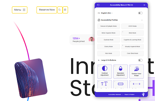
Welcoming Web is a web accessibility platform that works with digital teams to track and fix accessibility issues across WCAG 2.2, ADA Title III, and EN 301 549. The patterns it sees in scan data across thousands of sites consistently point back to the same design-stage decisions.
Color contrast: the design choice that excludes one in twelve men
Colour Blind Awareness reports that color blindness affects approximately 1 in 12 men and 1 in 200 women. That figure does not include the much larger population of people with low vision, age-related vision changes, or situational impairments like reading a screen in bright sunlight. When you make a color contrast decision, you are making a decision about who can read your content.
WCAG 1.4.3 requires a minimum contrast ratio of 4.5:1 between text and its background for normal-sized body copy. Large text (18pt or 14pt bold) requires 3:1. These are not arbitrary numbers. They are based on research into the minimum contrast at which text becomes readable for people with moderately low vision.
The 2025 WebAIM Million report found that low-contrast text appeared on 79.1% of home pages tested, with an average of nearly 30 instances per page. This is the single most common accessibility failure on the web, and it is made entirely in the design tool.
Checking contrast during design is straightforward. Most major design tools have contrast ratio checking built in or available as a plugin. The check takes five seconds. The failure to do it means that a substantial portion of every audience is trying to read text that does not have enough contrast to be visible to them.
Alt text is a writing skill, not a technical requirement
Every image on a website needs a text alternative that conveys the same information the image conveys. This is WCAG 1.1.1. Screen reader users, users on slow connections, and search engines all depend on it.
The reason this belongs in a conversation about visual communication is that writing good alt text is fundamentally a communication challenge, not a technical one. A developer can add an alt attribute to an image. Only someone who understands what the image communicates can write alt text that actually does its job.
Bad alt text describes what is in the image. Good alt text describes what the image communicates. For a photograph of a person using a screen reader at a desk, bad alt text reads “person at desk.” Good alt text reads “a person using a screen reader to navigate a website, demonstrating that accessibility tools require clean underlying code to function.”
The distinction matters because alt text is the only version of the image that a screen reader user receives. If the alt text describes pixels rather than meaning, the communication has failed. Designers and content creators are better positioned to write accurate, meaningful alt text than developers are, because they understand the intent behind the image.
The 2025 WebAIM Million report found that 18.5% of all images across one million home pages were missing alt text entirely. One in five linked images had no accessible name at all, making navigation impossible for screen reader users following those links.
Welcoming Web‘s scanning flags missing alt text as images are added to a site, which is faster than waiting for a designer review cycle that may never happen.
How typography choices affect users with low vision
Typography decisions affect accessibility before a user with a disability even encounters your site. Font size, line height, letter spacing, and typeface choice all determine whether text is usable by people with low vision, dyslexia, or cognitive processing differences.
WCAG does not mandate a minimum font size, but 16px is widely recognised as the baseline for comfortable reading. Below this, users with low vision have to work to read body copy that sighted users take for granted. Many sites use 12px or 14px for supporting text, captions, and form labels — the exact content that users most need to read accurately.
Line height matters equally. WCAG 1.4.12 (Text Spacing) allows users to adjust line height to at least 1.5 times the font size without loss of content or function. Designs that break at these adjustments fail this criterion and make content inaccessible to users who rely on wider line spacing to track text.
Typeface choice affects users with dyslexia. Highly stylised display fonts, condensed weights, and fonts with low letter differentiation (where letters like l, 1, and I are hard to distinguish) create unnecessary reading load. This does not mean only using generic sans-serif fonts. It means understanding that decorative choices carry a functional cost, and making that trade-off consciously rather than by default.
Visual hierarchy and how it can fail screen reader users
Visual hierarchy is a core principle of communication design. It uses size, weight, colour, and position to signal what is most important and guide the reader through content in a logical sequence. When it works well, it is one of the most effective tools in visual communication. When it is built using purely visual cues rather than semantic structure, it becomes invisible to screen reader users.
Screen readers do not interpret visual hierarchy. They read the underlying HTML structure: headings, landmarks, lists, and labels. A page that uses large bold text styled to look like a heading, but coded as a paragraph, does not communicate hierarchy to a screen reader. The heading hierarchy that sighted users navigate visually simply does not exist for users who navigate by structure.
The practical implication is that visual hierarchy decisions need to be reflected in the semantic structure of the page. A visually prominent section title should be an H2 in the code. A subheading beneath it should be an H3. This is not a significant constraint on design. It is a matter of ensuring that the visual language the designer creates is also expressed in the structural language the page delivers.
Animation, motion, and the people who need you to stop
Animation is a legitimate tool in visual communication. It directs attention, communicates state change, and adds character to interfaces. It is also a significant accessibility barrier for users with vestibular disorders, who can experience nausea, dizziness, and disorientation in response to motion on screen.
WCAG 2.3.3 addresses this directly. A quick note on the numbering: 2.3.3 is a success criterion number, not a version number — it sits within WCAG 2.2 under Guideline 2.3 (Seizures and Physical Reactions). It is rated Level AAA, which means it sits outside most legal compliance obligations, which typically reference Level AA. But that is a legal threshold, not a design one. The prefers-reduced-motion CSS media query lets designers respond to users who have requested reduced motion in their system settings. Implementing it takes less than an hour of additional consideration and costs nothing in terms of visual design.
Auto-playing video, parallax scrolling effects, and looping animations all carry real costs for this audience regardless of what the standard mandates. A user with a vestibular disorder who lands on a page with aggressive background animation may not be able to use that page at all. The decision to add motion is also a decision about who can access the content. Level AAA or not, that trade-off is worth making consciously.
How to check your visual design decisions actually hold up
Design decisions do not stay fixed after a site launches. New pages are added, components are updated, and the design decisions made six months ago are applied inconsistently by new team members working to different briefs. This means visual accessibility is not a one-time check at launch. It is an ongoing practice.
The 2026 WebAIM Million report’s finding that 95.9% of home pages had detectable failures, up from 94.8% the year before, suggests that even sites that were in better shape last year have slipped backward. New content, new templates, and new team members all introduce new decisions. Without a monitoring process in place, those decisions compound quietly until they become visible in a complaint or an audit.
For digital and communications teams who want to maintain the visual accessibility of their sites over time, setting up regular automated scans is the most practical starting point. Scans flag the contrast failures, missing alt text, and unlabeled elements that accumulate between design reviews. Pairing that automated baseline with genuine design literacy — understanding why contrast ratios exist, what good alt text communicates, and how visual hierarchy translates to semantic structure — is what makes the difference between accessible design as a compliance exercise and accessible design as a communication practice.
The designers and communicators who treat these as fundamental craft questions rather than technical footnotes build things that work for more people. Welcoming Web exists for the teams who want to monitor and maintain that accessibility standard after launch, not just at it.