


Someone posts a home tour, and the countertops are quartz, the backsplash is subway tile, the open shelving holds a small fleet of white dishes arranged with an effort that pretends not to be effort. The comment section takes about twelve minutes to curdle, not with cruelty exactly but with that specific tone of fond retrospective pity, the kind reserved for things that were loved too publicly and are now paying the social price for it. “Very 2018,” someone writes, and the words land with the weight of a diagnosis.
They Kept the Shiplap Up and Everyone Noticed
For a while, shiplap was a kind of shorthand for a certain aspirational warmth, reading as cozy and considered and somehow rustic without being rural, which is a very specific emotional promise that certain interior choices make and rarely survive keeping.
People who renovated in 2016, using the visual language of that time, who found themselves in 2026, reading what they had now made into a cautionary example, not because they had done something wrong, but because they had not changed in any way.
The Room Started Performing for Its Audience
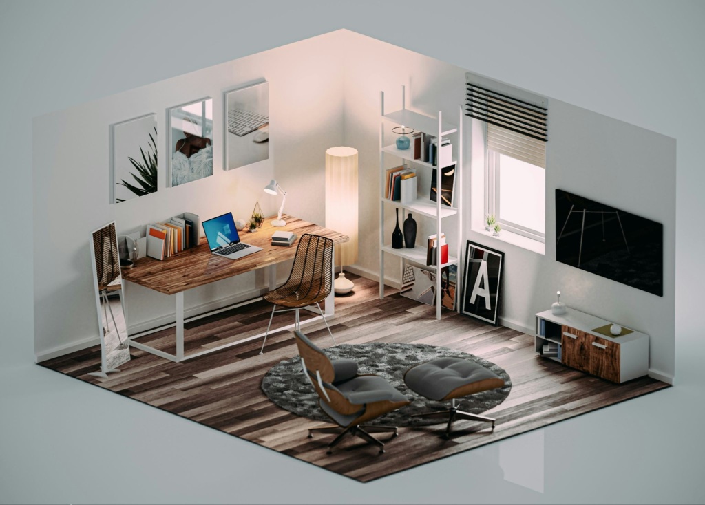
When interiors cease to be intimate spaces and become public statements, there is a particular type of anxiety that arises. Design decisions turn into messages that visitors scan to get information on consciousness, preference, speed, and cultural consciousness. A good product visualization company making a modern kitchen for a real estate portfolio or an editorial spread will be making hundreds of subtle aesthetic choices that will ultimately decide how “new”, “transitional”, or “well-loved and long overdue” the kitchen will look.
The same relaxed style has spread to the living rooms of the nation, turning into something of a ritual:
- Bathroom regret spiral describes the strange sensation attached to seeing new tile trends emerge barely a year after a renovation was completed. The feeling resembles purchasing a phone immediately before a redesign, except bathrooms cannot be boxed up and exchanged once the cultural momentum shifts elsewhere.
- The “lived in” reframe: A stealthy rhetorical trick that turns an interior that seems to look like it’s from a different era, but that still looks relevant, into some kind of “timeless” or “classic” category, rather than a category of design.
- Before and after as confession: As long as the before is relatively recent, so that those viewing the renovation can instantly tell the difference, since the kitchen wasn’t neglected or broken, but it just wasn’t right, and the homeowner knew it, but couldn’t articulate it directly.
- The comment section consensus: Threads where collective taste gets articulated in real time and where “I love how warm it feels” and “very cozy, very 2015” can coexist in the same reply chain and mean, with only slight variation, almost the same thing.
- The preemptive hedge: People who have just renovated, describing their choices online with a defensive specificity, explaining why they went with a particular finish or profile because they wanted something that would hold up, which reveals an awareness of how quickly “holds up” stops being true.
What connects all of these patterns is the way interior choices have started to function like posts. Static objects that accumulate context over time, gaining or losing legibility based entirely on what the broader culture does after the grout dries.
The Throw Pillows Were Load-Bearing
One increasingly common renovation behavior rarely receives a proper name: the preemptive update. Perfectly functional kitchens disappear because a cabinet tone has started to feel culturally overexposed. This is not because a wall’s color is ugly, but because, after a dominant trend has been followed for a while, there are unintended cues that the owner is stuck in a rut.
This type of interior unease is hard to describe simply as vanity, and is more about an uneasy feeling that spaces are more and more presenting themselves as constant assertions of perceptions, adaptability, and cultural relevance, the visual language of which is constantly being upstaged by its own communicative force, and by as much as it can be held up. In the interim, the physical environment of an earlier time stands in place and goes on talking long after the surrounding aesthetic language has shifted.
The House Held Still While Everything Else Moved
What makes this particular fear so difficult to shake is that interiors are expensive and slow and largely permanent in a way that other aesthetic choices simply aren’t. A wardrobe can be updated, a profile picture revised, a newsletter font quietly changed on a Tuesday afternoon without anyone needing to know. Open shelving cannot be easily uninstalled at the precise cultural moment when open shelving stops reading as thoughtful and intentional and starts reading as a person who ran out of cabinet budget and called it a philosophy.
Part of the discomfort comes from how personal these spaces once felt during the renovation itself. The choices seemed thoughtful and current at the time, so watching them slowly turn into visual shorthand for another era can feel unexpectedly embarrassing.