


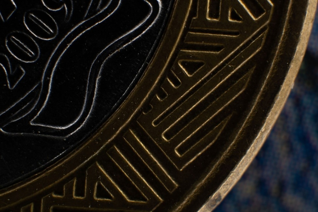
A challenge coin is one of the smallest design briefs there is. You have a metal disc, often under 2 inches across, and two sides to tell a whole story. Get it right and people carry it for decades. Get it wrong and it ends up in a drawer.
Alt text: Close up of an engraved metal military challenge coin
That makes the coin a perfect case study in visual communication. Every choice, from the emblem to the edge, carries meaning. A specialist maker like Challenge Coins 4 Less turns those choices into a finished object, but the design thinking behind them is what separates a keepsake from clutter. Here is how that thinking works.
What Is a Challenge Coin?
A challenge coin is a small medallion that proves membership or marks an achievement. It started in the military and spread far beyond it.
The tradition runs deep. Coins have long been used to build unit identity and reward service, a practice documented across the National Archives military records. Today they are carried by first responders, companies, and clubs, but the core idea has not changed. A coin says you belong to something.
There is also a ritual attached. In the original challenge, a member produces their coin on demand, and anyone who cannot buys the next round. That game turned a simple token into a badge of pride worth carrying everywhere, which is exactly why the design has to earn its place in a pocket.
That heritage is part of the appeal. Challenge coins are such a fixture of service culture that they are collected and displayed in institutions, including the CIA Museum. The weight of that history is something a good design has to honor.
Why Does the Design of a Challenge Coin Matter?
Because the coin is the message. Unlike a certificate that sits in a frame, a coin lives in a pocket and gets handed across a table.
A well-designed coin does three jobs at once. It identifies the group, it commemorates a moment, and it signals status to anyone who sees it. Those are the same goals behind any strong piece of visual persuasion, compressed onto a 2-inch canvas.
Poor design breaks that chain. A cluttered face, an unreadable motto, or a cheap finish tells the holder the moment did not really matter. The design is not decoration. It is the entire point.
What Visual Elements Make a Coin Work?
A handful of elements do the heavy lifting. Each one is a deliberate visual choice, not an accident.

Photo by Kelly Sikkema on Unsplash
Alt text: Designer sketching a circular emblem at a desk
The core building blocks are few but powerful:
- The central emblem, the single image that carries the identity.
- Typography, a motto or name that must stay legible at a small size.
- Color, often added with enamel, used sparingly for impact.
- Shape, since coins need not be round, and a custom edge adds distinction.
- Finish, such as antique, polished, or gold, which sets the tone.
Restraint is the rule. The best coins resist the urge to cram everything in. They pick one strong symbol and let it breathe, the way a clear visual message always beats a noisy one.
Material plays a part too. The base metal, the thickness, and the weight all register the moment someone picks the coin up. A heavier coin with a crisp strike simply feels more valuable than a thin, flat one. Touch is part of the design, not an afterthought.
How Do You Design a Coin People Will Keep?
Start with meaning, not graphics. Ask what the coin needs to say before you ask what it should look like.
A few principles guide a coin worth keeping:
- Lead with one clear symbol that captures the group or the achievement.
- Keep text short, since a long motto turns to mush at coin size.
- Use color and texture to reward a closer look.
- Match the finish to the occasion, formal or playful.
Symbolism is where this gets rich. A figure of speech works by standing in for a bigger idea, and a coin’s emblem does the same in metal. Designers who understand the rhetorical triangle know that credibility, emotion, and message all have to align. A single well-chosen figure of speech can inspire the visual metaphor a coin is built around.
Designing for Meaning, Not Just Looks
A challenge coin succeeds when the holder feels the weight of what it represents. That feeling is engineered, not lucky. It comes from a clear symbol, readable text, a fitting finish, and the restraint to leave the rest out.
Treat the coin as a message first and an object second. Decide what it must communicate, choose the fewest elements that say it, and let a skilled maker translate the design into metal. Do that and you create something nobody wants to put in a drawer.
Frequently Asked Questions
What Size Are Most Challenge Coins?
Most fall between 1.5 and 2 inches in diameter, with 1.75 inches a common standard. Larger coins, up to 3 inches, exist for special editions where the extra surface allows more detail. The size affects how much design you can include, so legibility should guide the choice rather than the urge to go big.
Can a Challenge Coin Be a Shape Other Than Round?
Yes. While round is traditional, custom shapes are common and powerful. A coin can take the outline of a shield, a badge, a state, or an emblem tied to the group. A distinctive shape boosts recognition and makes the coin feel bespoke, though it should still sit comfortably in a hand.
How Many Colors Should a Coin Design Use?
Fewer than you might think. Two or three well-placed colors, usually applied as enamel, give impact without clutter. Too many colors compete and cheapen the look. Many of the strongest coins rely mostly on the metal finish, using color only to highlight a single key element of the design.
What Makes a Challenge Coin Look Cheap?
Cluttered layouts, tiny unreadable text, thin metal, and sloppy color fills are the usual culprits. A cheap coin tries to say too much and invests too little in finish. Quality shows in restraint and craftsmanship, a clean design with a solid weight and a finish that suits the occasion it marks.