


When you’re selling a physical item, customers can see it, touch it, and understand its value. But a digital product, like an online course, an ebook, or a software subscription, presents a unique challenge: how do you make something intangible feel real and desirable?
The answer lies in powerful visual communication. By translating your product’s benefits into compelling visuals, you can grab attention, build trust, and guide potential customers toward a purchase.
Showcasing Your Digital Product
Before you can sell your digital product, you need a professional place to host and present it. The visual look of your product’s “home” is the first thing customers will notice.
A clean, well-organized, and visually appealing platform immediately signals quality and credibility. This is where visual communication becomes so important. It’s not just about making things look pretty; it’s about using images, layouts, and branding strategically to get your message across clearly.
For creators of online courses or membership sites, all-in-one platforms are often the best choice. They come with templates and tools specifically designed to show off digital content effectively, making sure users have a smooth experience from the sales page to the course modules.
If you’re considering this option, look for special promotions like a Kajabi offer. This can give you access to professional tools at a lower starting cost, helping you build a visually impressive storefront for your digital goods.
High-Impact Mockups and Previews
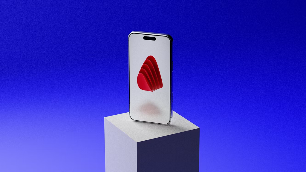
Since customers can’t physically hold your digital product, you need to help them imagine it. This is where mockups really shine. A mockup is a visual representation of your digital product placed in a real-world setting. For example:
- An online course shown on a laptop, tablet, and smartphone screen.
- Your ebook cover displayed on an e-reader.
- A preview of your software dashboard inside a browser window.
These images make your product feel tangible and accessible. They show customers exactly what they’re getting and how they might use it. Creating high-converting digital product mockups involves more than just pasting a screenshot onto a stock photo. Use high-quality device images, make sure your product’s interface is clear, and add elements that suggest value, like a stack of “workbooks” next to a laptop showing your course.
Using Color Theory in Sales Funnels
Color is a powerful tool that can influence mood and behavior. A smart color palette, used consistently across your sales funnel, can guide users and strengthen your brand identity. Start by picking a main brand color, a secondary color, and an accent color.
Your accent color should be the most eye-catching of the three, and you should save it for key calls-to-action (CTAs), like “Buy Now” or “Sign Up” buttons. Colors like orange, green, and blue are popular for buttons because they stand out without being alarming. Meanwhile, your primary and secondary colors should create a pleasant and trustworthy background on your pages and in your ads. Consistency is crucial; when a customer clicks an ad and lands on a page with the same color scheme, it feels familiar and reduces any hesitation.
Designing Effective Landing Pages
Your landing page has one main job: to turn visitors into customers. Its visual design is key to making that happen. An effective landing page uses visual hierarchy to guide the visitor’s attention. The most important elements, usually the headline and hero image, should be the most prominent.
A strong hero shot, such as an image or short video that shows your product in action or highlights its main benefit, can immediately connect with your audience. As users scroll, use headings, subheadings, and white space to break up text and make the information easy to read. Include social proof with high-quality photos of customers in your testimonials.
Finally, make sure your CTA buttons are visually distinct, using your chosen accent color, and placed logically where a user is most likely to make a decision.
Visuals for Email Marketing Campaigns
Email marketing remains a vital way to nurture leads and drive sales for digital products. However, a wall of text probably won’t hold anyone’s attention. Adding visuals to your emails can significantly boost engagement. Start with a clean, branded header that makes your emails instantly recognizable.
Use relevant images or custom graphics to break up long sections of text and illustrate your points. If you’re promoting your course, include a mockup or a compelling still from a video lesson. Even simple visual elements like icons or styled block quotes can make your content more scannable and appealing. And just like on your landing page, make your email’s call-to-action a brightly colored, clickable button instead of a simple text link.
Ultimately, a cohesive visual strategy does more than just make your digital product look good. It builds a brand, communicates value, and makes the intangible feel real, turning curious visitors into loyal customers.