


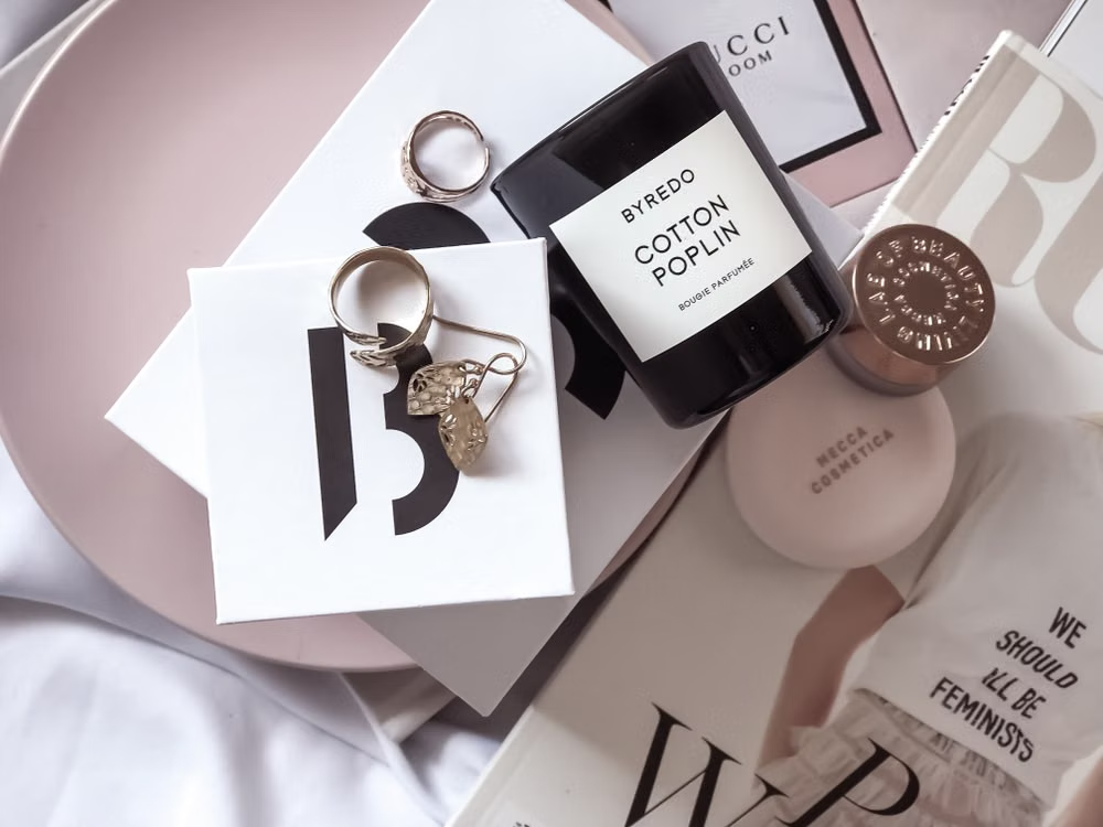
A potential customer arrives on your website for the first time. Before they read a single word of copy, they’ve already made a judgment about your brand. That judgment comes from what they see — the colors, the layout, the imagery, and how it all holds together. This is especially true in industries like skincare, where the visual experience carries as much weight as the product itself.
When someone browses Meamo’s microneedling pen and serum lineup, for example, the minimalist photography and consistent design language already tell a story about quality before a single ingredient is mentioned. That’s the role visuals play for aesthetic brands — they don’t just attract attention; they earn trust before a transaction ever happens.
Here’s how they do it.
Maintaining Consistency Across Every Touchpoint
Trust grows through repetition. When a customer sees the same color palette, typography, and design language across your website, Instagram feed, packaging, and email campaigns, it signals stability. The brand feels predictable in a good way — it looks like an operation that pays attention to detail.
Inconsistency does the opposite. A polished website paired with a sloppy social media presence creates doubt. Customers start wondering which version of the brand is real.
- Use a documented style guide to keep fonts, colors, spacing, and image treatments uniform.
- Audit each platform regularly to catch visual drift before it becomes noticeable.
- Treat packaging, invoices, and transactional emails as brand touchpoints — not afterthoughts.
Choosing Color Palettes That Communicate Value
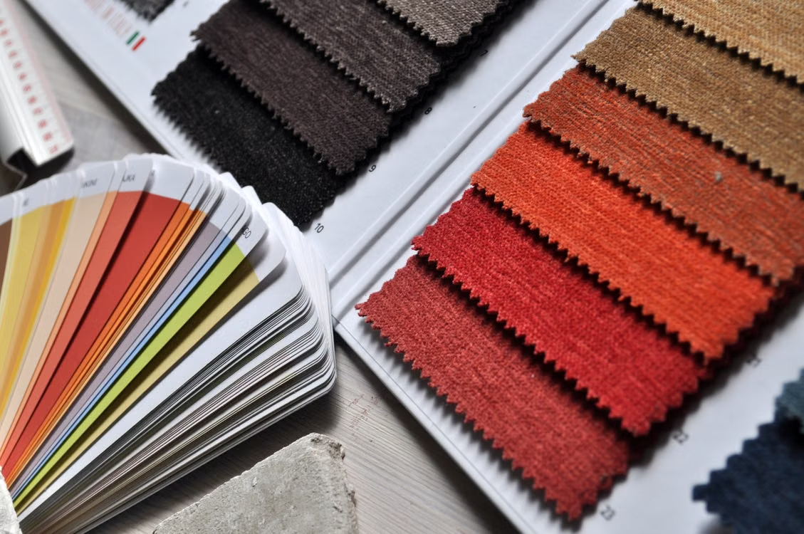
Color does more than make a page look appealing. It sends a message. A skincare brand using soft neutrals and white space communicates cleanliness and simplicity. A fitness brand using bold contrast and dark tones signals intensity and performance.
The key is alignment. The palette should match what the brand promises. When there’s a disconnect — a luxury brand using colors that feel cheap, for example — customers pick up on it, even if they can’t articulate why something feels off.
- Select a primary palette of two to three colors that reflect the brand’s positioning.
- Use accent colors only for important things like buttons and key features.
- Test how the palette renders across screens, print materials, and packaging to avoid unexpected shifts.
Using Typography to Set the Right Tone
Fonts carry personality. A serif typeface suggests tradition and authority. A clean sans-serif reads as modern and accessible. Script fonts lean toward elegance or creativity, depending on the context.
Aesthetic brands that build trust tend to limit their font selections and use them with discipline. Too many typefaces on a single page create visual noise, which makes the brand feel disorganized. A controlled typographic system, on the other hand, makes content easier to scan and gives the overall experience a sense of order.
- Stick to two or three typefaces maximum across all brand materials.
- Assign each typeface a clear role — one for headlines, one for body text, one for accents if needed.
- Prioritize legibility on mobile screens, where most browsing now happens.
Investing in Original, High-Quality Imagery
Stock photography is easy to spot. When customers see the same generic office photo on three different websites, it erodes authenticity. Aesthetic brands that build trust invest in original visuals — product photography, lifestyle shots, behind-the-scenes content — that can’t be found anywhere else.
This doesn’t require a massive budget. A consistent photo style with controlled lighting, a defined color temperature, and intentional composition can elevate even simple product shots into something that feels cohesive and owned.
- Develop a photography style guide that covers lighting, backgrounds, angles, and editing presets.
- Feature real products in real contexts rather than relying on renderings or placeholders.
- Use customer-generated content selectively, ensuring it meets the brand’s visual standard before publishing.
Designing Layouts That Guide the Eye
A cluttered layout forces the viewer to work. A structured layout does the work for them. Visual hierarchy — the deliberate arrangement of elements by size, contrast, and placement — determines what the viewer sees first, second, and third.
Brands that build trust through visuals make navigation intuitive. The most important information stands out. Secondary details support without competing. White space gives the design room to breathe, which makes the entire experience feel more considered and less rushed.
- Use size and contrast to establish a clear order of importance on every page.
- Break long content into sections with subheadings and supporting visuals.
- Leave enough white space to prevent the layout from feeling dense or overwhelming.
Final Thoughts
Visual trust isn’t built through one element alone. It comes from the cumulative effect of consistent colors, controlled typography, original imagery, and intentional layout working together across every customer interaction. For aesthetic brands, getting these fundamentals right isn’t optional; it’s the foundation everything else is built on.