


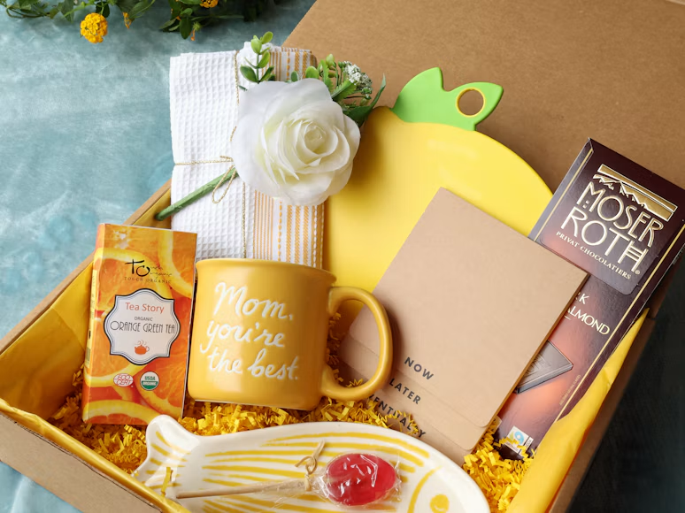
A thoughtful gift communicates before the recipient opens the box. Its color, scale, materials, and presentation create expectations about the giver and the relationship. For businesses, those details can turn a familiar gesture into a meaningful point of contact.
Gift design also draws on several well-established psychological principles. People respond to attractive presentation, personal relevance, and the sense that someone has made a genuine effort. Understanding those responses helps you create gifts that feel generous and memorable without becoming overly promotional.
First Impressions and Visual Appeal
People form a quick opinion of a gift based on visible cues such as packaging quality, color harmony, and typography. A neatly arranged box signals care before its contents come into view. Uneven printing, excessive branding, or an awkward mix of colors can send the opposite message.
Start with a clear visual hierarchy. The recipient should notice the gift itself first, followed by the sender’s identity and then any supporting message. Keep the logo appropriately sized and leave enough open space around it. Crowding every available surface with text makes a package feel like an advertisement.
Color should reflect both the occasion and the relationship. A bright palette may suit an employee celebration, while restrained neutrals could work better for a professional milestone. Consistency matters more than any specific color choice. The box, card, tissue, and printed details should look like parts of one system.
Businesses that need a coordinated edible gift can consider business gifts from Sprinkle+Bean, which can include custom logos on boxes, personalized cards, and handcrafted Brazilian brigadeiros. Volume pricing and multi-address shipping can also help teams maintain the same presentation across a larger recipient list.
Before approving any package, view a physical sample in natural light. Screens can misrepresent color and scale, while a sample reveals whether text is legible and materials feel appropriate.
The Reciprocity Principle in Business
A gift can influence a professional relationship through reciprocity, the social tendency to respond positively when someone gives first. The reciprocity principle also appears in user experience design, where useful information or a helpful feature can build goodwill before a company asks the visitor to act.
This effect depends heavily on intent. A useful, timely gift may encourage warmth and loyalty, but an extravagant item paired with an immediate sales request can create pressure. Keep the gesture proportionate to the relationship and allow it to stand on its own.
For example, a real estate team might send a modest closing gift with a handwritten message that refers to a detail from the client’s experience. A sales team could thank a long-term customer on the anniversary of their first order. In each case, the gift recognizes an existing relationship instead of manufacturing an obligation.
The connection between giving first and loyalty offers a useful lesson for customer experience: generosity works best when recipients find it sincere. Behavioral design guidance on reciprocity at work makes a similar point about initiating positive exchanges.
Avoid attaching a promotional demand to the package. If follow-up is appropriate, wait several days and keep it conversational. A simple note asking whether the gift arrived safely protects the generous tone of the original gesture.
Crafting an Unforgettable Gifting Moment
Memorability often comes from the sequence of the experience. The outer package creates anticipation, the opening reveals the gift, and the card explains why it was sent. Each stage should support the same idea.
Map that sequence before choosing decorative details. Ask what the recipient sees first, what they touch next, and when they encounter the message. If the box opens with the card hidden underneath everything else, the context arrives too late. Place the note where it can guide the experience from the start.
Good pacing also requires restraint. Multiple layers of difficult wrapping may look impressive in a photograph but frustrate someone opening the gift at a desk. Use materials that protect the contents and create a pleasant reveal without turning unboxing into a chore. Recyclable paper, a fitted insert, and one well-positioned card will often do more than elaborate decoration.
Timing shapes the moment as much as packaging does. Gifts sent during crowded holidays compete with many similar deliveries. A thank-you package sent after a completed project or on a client anniversary may receive more attention because it connects to a specific event.
This approach echoes the broader design idea of creating work that can inform and delight. The package gives practical information about who sent it and why, while its colors, materials, and reveal provide the pleasure. Both functions should feel unified.
Personalization: A Visual Connection
Personalization helps a recipient recognize that the gift was selected for them. The strongest details are accurate, relevant, and easy to see. A correctly spelled name on a card can carry more emotional weight than a costly generic object.
Begin with information your organization already has permission to use. A project name, work anniversary, or brief reference to a shared accomplishment can give the message specificity. Avoid personal details that may feel intrusive, particularly when the relationship has remained mostly professional.
Visual personalization can extend beyond printing a name. A company might select card colors that echo a completed campaign or use a message layout inspired by the project’s visual identity. For an employee recognition program, a consistent card template can leave room for managers to add two or three sentences about the person’s contribution.
Create a short review process before production:
- Confirm the recipient’s preferred name and spelling
- Check the shipping address against the latest record
- Match the message to the correct occasion
- Review logos at their intended print size
- Have a second person proofread every custom card
Automation can handle names and addresses, but the message still needs a human voice. “Thank you for helping us meet the June launch date” feels more credible than a general statement about valued partnership.
Keep the visual system consistent across recipients. Personal details should change while typography, spacing, and package quality remain stable. That balance gives each person an individual connection without weakening the organization’s overall identity.
Beyond the Gift: Lasting Visual Impact
The most effective gifts leave behind a clear impression of the relationship, even after the contents are gone. That impression comes from coherence. The item, package, and note should express the same level of care that recipients encounter in emails, meetings, and customer service.
Repetition can help establish recognition, though it needs to be subtle. Using a familiar brand color on a small card or repeating an established illustration style creates continuity. Covering every component with a large logo usually reduces the sense of generosity. Let the recipient’s experience lead and allow brand recognition to follow naturally.
A practical way to assess impact is to track responses without treating the gift as a direct-response campaign. Record delivery confirmations, thank-you messages, and any unprompted comments about the presentation. Teams can also compare occasions over time. If personal milestone gifts receive warmer responses than standard holiday mailings, that pattern can guide the next budget.
The principle behind give-first marketing applies here: value should arrive before a sales message. A recipient who remembers feeling appreciated may be more receptive during a later conversation, though that response shouldn’t be treated as a debt.
Once the program ends, save photographs, print specifications, and approved message templates. These records make future gifts easier to reproduce while preserving the visual details that worked. The lasting impression begins with a box, but it depends on disciplined design and a message specific enough to feel true.