
Color Rule: Seek Harmony & Relationship
Color has the tremendous ability to draw attention, aestheticize, create meaning, and give emphasis. To effectively do any of those four, though, you have to be strategic about creating harmonies and relationships. Sometimes the relationship can be contrasting or jarring, but if done intentionally, the contrasting relationship can give meaning and emphasis. Other times, when emphasis or attention isn’t the ultimate goal, a harmonious blend between colors can unify and beautify a design.
Harmonious Relationships
Review the four designs on the upper half of the right page, each which achieves harmony and relationship in different ways. The concept flier on the top left effectively uses a contrasting relationship between the dark blue and magenta of the photo with the bright yellow text space. This color contrast draws attention to the words, giving the background photograph a secondary or tertiary point of emphasis. The colors fit a triadic color scheme and do not clash, thus they create a harmonious relationship.
The “cityscape” photo on the top right harmoniously blends dark hues to create a somewhat dreary mood, but the bright yellow water taxi contrasts these colors and simultaneously connects to the yellow ‘e,’ providing new meaning (and emphasis) to a happy and secluded water taxi ride.
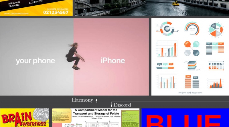
The use of a bright pastel in contrast to a drab gray makes the transition to an Apple phone seem a calm and welcoming move. The colors contrast while creating a harmonious relationship. Likewise, in the collection of charts and graphs designed by Freepik on the bottom right, contrast is important to communicate different data, but the colors work in harmony across all graphs to create a consistent color relationship.
Discordant Relationships
The opposite of harmony, of course, is discord, which you should most always avoid. Unless designed with a specific rhetorical effect in mind, discord builds unwanted tension and can be incredibly unpleasant to look at. Effectively engaging your audience requires you to build harmonious color relationships that make clear connections between color and meaning. When you create discordant color combinations, you not only show a lack of professionalism, you create an unclear demonstration of meaning and ambiguous relationships. If no clear relationship is built and the colors simply contradict, emphasis and effect are muddled and they can kill the effectiveness of your design.
The Brain Awarness poster on the left, created by the Science Centre, uses few clear color relationships, providing little emphasis other than in the title. Colors contradict in style, tone, and hue, creating a discordant feel and a less-than pleasing appeal.
The scientific poster in the center, created by researchers at Duke University, likewise shows no strategic coloring, creating only visual noise and discordant visuals, an unfortunate, unprofessional display of scientific research that inadvertantly damages credibility.
On the right, an example of one of the most discordant color combinations is shown. If you feel like you’re getting a headache looking at the image, it’s because fully saturated red and blue each tell the eye that they should be dominant. When placed on top of each other, red and blue create a disharmonious vibrating effect so awful the phenomenon has a name: chromostereopsis.
I can definitely see what you are talking about — but beyond that, I am clueless. I have no idea how to use color in our emails and online publications. I go with blues and few reds because that’s all I know. Where should I start? I can’t just “do stuff that looks good” because I have no visual sense at all. (Writing and editing, that’s another thing altogether.)
So — pointers? A system? A plan?