
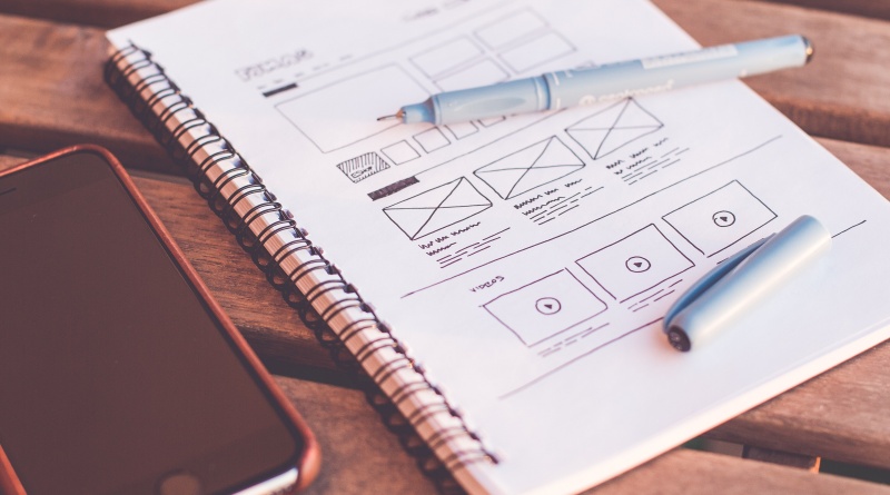
Essentials of Visual Hierarchy for a Good Web Design
Quality web design is not only about the latest technologies and catchy slogans that motivate people to buy your product. Every web design that can be called successful follows specific rules for content organization called a “visual hierarchy”. The human brain is organized in a certain way so that it pays attention to certain elements and patterns while ignoring others. For designers to create a product that will be useful and easy to navigate for users, they have to apply these rules in practice, the basics of which you will find covered in this post.
Fundamentals of Hierarchy in the Design Interface
Design agencies utilize sizes, shapes, and colors to create a product. Any interface should be convenient and user friendly. The visual hierarchy allows you to organize information and elements in such a way that the user can quickly figure out the new interface and distinguish the main from the secondary.
Size
Significant elements on the pages attract users’ attention in the first place. The larger the item, the higher the importance, the more weight it has. And vice versa – smaller elements are less visible in the visual hierarchy. This allows you to distinguish between structure, highlight blocks, and better navigate the page if we’re talking about the web interface.
Color
Color is one of the main methods of conveying information in a design. They have so much background and context that even the same shadow of red with a different saturation of brightness can create different impressions for the viewer.
From the point of visual hierarchy, it is possible to prioritize elements on the webpage using colors. If one element is dark and the nearest one is lighter, obviously the first will be more noticeable.
Contrast is another convenient tool for highlighting important elements on a page. For example, the title may be more contrasting than the text itself.
Pay attention to hue, a natural ability of some colors to stand out over others. Hue can be an effective tool for making the design original and catchy, but they most often create visual conflicts like red vs. green, violet vs. green, and so on.
Proximity
Groups of elements attract more attention than a single element on the page because we attribute more importance to numerous elements. That’s why we usually place menu buttons close to each other and not in random corners on the screen.
Another thing is that users tend to connect the elements that are found near each other. For example, if there is a “Buy” button, we will seek out a “Cancel” button right near to it. They are in a relationship of opposition to us. So when choosing where to position the elements on the screen, be aware of this logic to avoid confusion.
Negative Space
If you’ve ever looked at a website and liked it but couldn’t understand why, the reason is probably negative space, or white space. Negative space is extremely helpful in perception. A study conducted back in 2004 found that the appropriate use of white space between paragraphs or on the right and left of the main content improves perception by almost 20%. It’s easier for users to focus and process the content. A simple, yet powerful tool.
Texture
Playing with textures is probably one of the most fun activities in organizing visual hierarchy. Smooth and glossy surfaces attract more attention than a mate. Their contract can create the sensation of a very luxe product. Minimalism rules the market now, so the times when designers were trying to outwit each other, creating realistic fur, bricks, and leather textures on websites are long gone. However, you can experiment with them and try to add your own style to the time-proven techniques.
Conclusion
When a design does not have a clear visual hierarchy, user navigation becomes hard. It is the job of a UX/UI designer to use colors, textures, shapes, and sizes to immerse the user into the product and build a journey inside that product. Visual hierarchy helps the customers to see what to pay attention to and gently guides them.