

Giving P.O.W.E.R.F.U.L. Presentations: “E” is for “ENGAGE with Visuals”
HOME > SPEAKING > POWERFUL PRESENTATIONS > “E” Is for ENGAGE
Presentations are better with visuals. That isn’t just an opinion or personal preference. Research backs it up. If you can supplement your presentation with impactful, relevant images, people will be far more likely to pay attention and recall your presentation better. Images and visualized information help people stay focused, learn faster, and remember better. That’s a fact.
While slide decks are the most common method and certainly an effective way to integrate visuals into your presentation, they’re not your only options. You could bring in physical images that you pass around a room; you could use a handout or display a poster; or you could bring in a physical object that people can look at. Regardless of your method, the point is to give the audience something to look at that supplements and enhances what you have to say.
In this article, I’m focusing primarily on using slide decks like PowerPoint or Keynote.
When visualizing information for a slide deck, you’ll want to do four things:
- Visualize Your Content
- Organize Your Slides
- Avoid Slide Design Faux Pas
- Enhance Professionalism with Visual Techniques
1. Visualize Your Content

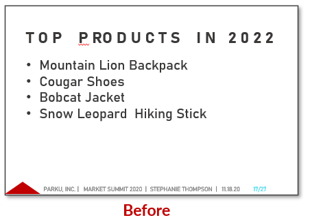
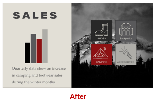
Get rid of that text! (At least, as much as possible.) Text on slides has been proven to be more distracting than helpful. If you place large amounts of text on a screen—even in bulleted lists—you force your audience member to try to both listen and read at the same time, making it very difficult to pay attention. Plus, our brains are just hardwired to recognize, understand, and remember visuals better. That’s how humans work.
When audiences come to a presentation, they expect to listen to the presenter and to be engaged with interesting content. They don’t come expecting to read a report on a big screen. If a report is what you’re going to create, just email that to everyone and skip the presentation. Presentations should be engaging, they should enhance learning, and they should encourage recall and action. That’s done, in large part, by visualizing content.
In every instance where it makes sense, turn textual information visual. Yes, that means trying to eliminate bulleted lists as much as possible, if not entirely. Most of the TED Talks (which represent some of the greatest presentations of our time) you’ll watch include very simple slides, often with just a photo on them. That’s what we need to do. Simplify and visualize.
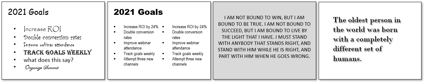
If you have content that you feel compelled to put into a list, note that you can make bulleted lists visual by using an icon or image that represents each item in the list list. Like this:
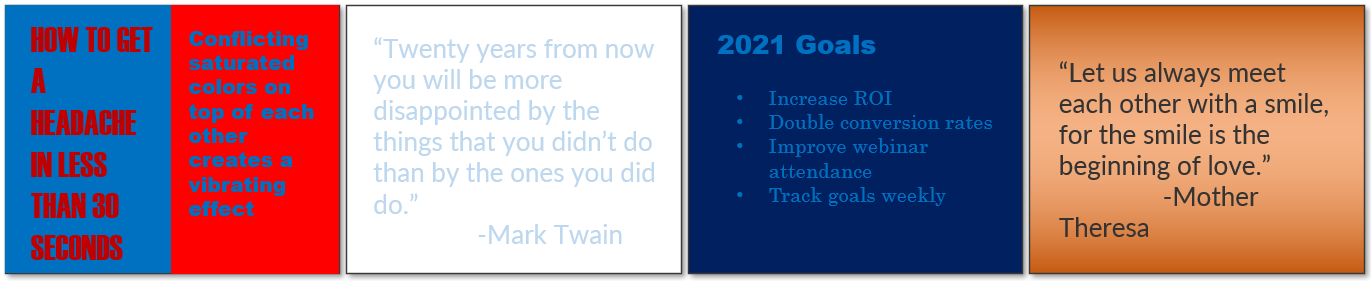
If text is absolutely necessary—like if you’re including a really important quote for everyone to see and remember—still try to make it visual. Something like this:

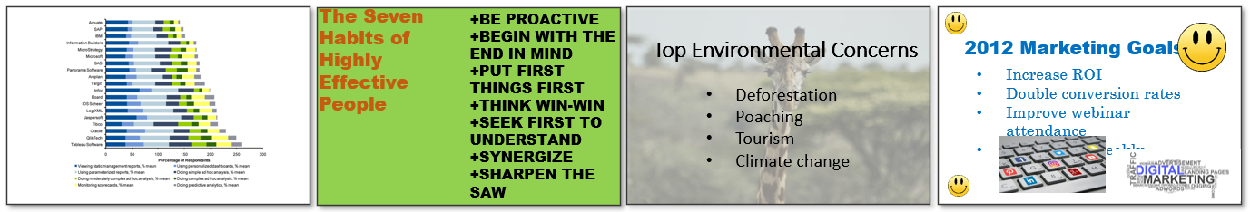
There are infinite ways to visualize your content. You can use diagrams, icons, charts or graphs, photographs, or drawings. Any of those will enhance your presentation. Look for creative ways to integrate visuals into your presentation!
2. Organize Your Slides

In addition to visualizing your content, you can help your audience by organizing your slides. Just like you would see in a book—where there is a cover, chapter pages, and ending pages—you want to help your audience members know where they’re at within your presentation using different slide designs.
As you move from one type of content to another or from one section to another, it helps to visually create a unique slide design that clearly says, “we’re entering a new part of the presentation,” or “now, this is a quote or a poll question.”
Slide organization is especially helpful if a presentation is long (20 minutes or more), where you’d likely be moving between sections, such as “Introduction,” “Research Methods,” “Findings,” and “Recommendations.”
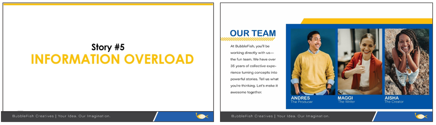
Usually, you’ll want four or five different slide types (see example above):
- Title Slide (first slide of presentation)
- Section or Signpost Slide (slide that designate a transition between sections)
- Body Slide (majority of slides where general content is contained)
- Callout Slide (quotes, poll questions, or other unique types of content)
- Closing Slide (slide that clearly identifies the end of the presentation
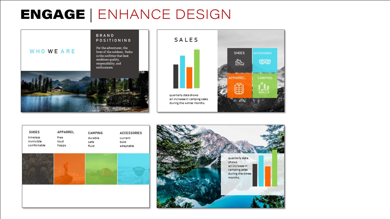
It’s important to note that not all body slides need to look the same, though. While you do want to ensure that all slides look and feel similar—using the same fonts, colors, and general shapes, mood, and feel—it’s okay to have some variation with your body slides. In fact, it’s good for visual interest and engagement to create some variation. Look at these slides:

See how they are different layouts? They create some visual variety, but it’s still clear that they’re part of the same slide deck because of the colors, fonts, and photography. Here’s another example of two different body slides within the same deck:
The goal is to be organized, strategic, creative, and visually interesting. If you can do that, your audience will be impressed. Guaranteed.
3. Avoid Slide Design Faux Pas
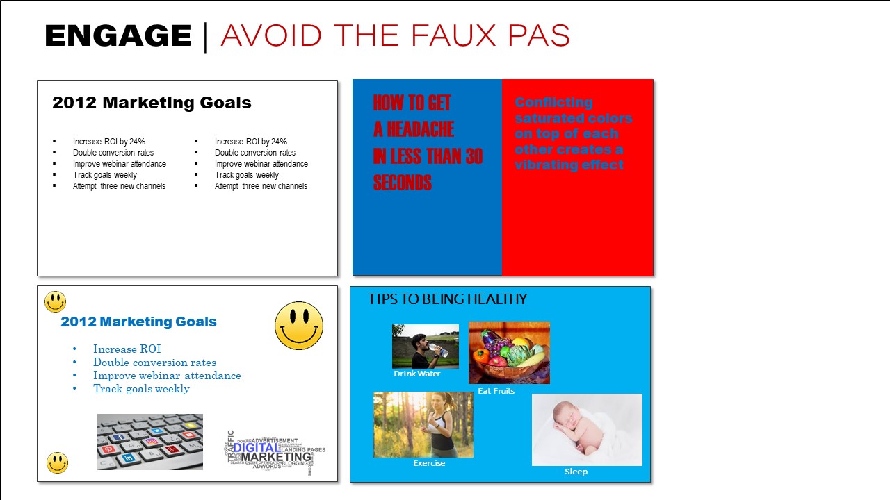
In order to ensure your slides are professional and attractive, start by avoiding some of the most serious design faux pas for slide decks. Below, I cover 16 different things to avoid. For a more complete list, check out 40 Ways to Screw Up a PowerPoint Slide.
Tumultuous Text
As I’ve already noted, you’ll want to avoid too much text. In addition, avoid these common issues with text:
- Terrible Typefaces. Avoid using fonts that are overused, hard to read, cliché, culturally insensitive, or in conflict with the personality of your content and presentation.
- Abundance of Bullets. Remember that bulleted list after bulleted list doesn’t help your presentation. It hurts it.
- ALL CAPS CRAZINESS. When you must include text (like when quoting someone and the exact wording matters), avoid using all caps. While caps are usually okay for headings and titles, they’re not great for paragraphs since they’re blocky and harder to read.
- Frenetic Effects. Just because it’s possible doesn’t mean you need to do it. While programs like PowerPoint give you the option to create fading or animated information, drop shadows, bevels and embossing, etc., you’ll rarely want to use them. In general, make text simple and easy to read.
Color Catastrophes
Make sure your color uses high contrast (black on white or white on black works really well!), focusing on just one or two accent colors. In addition, avoid these other common problems:
- Chromo Conundrum. Avoid placing two colors that dramatically contradict on top of each other. Blue on red, red on blue, green on red, or red on green are especially bad.
- Two-Light Frights. Make sure your colors have high contrast between each other. Putting light text on a light background is incredibly uncomfortable to read.
- Two-Dark Disasters. Similar to having two light colors on top of each other, two dark colors on top of each other is painful for your audience to look out. Help them out with high contrast on every slide.
- Egregious Gradients. Without a keen eye to design or a background in art, I usually recommend avoiding gradients. They tend to look old fashioned at best. At worst, they make slides look really unprofessional and hard to read.
Busyness Blunders
Keep the amount of information per slide to a minimum. It’s okay to have more slides and move between slides. But putting too much information on one slide has a similar problem to a slide full of text—it makes it difficult for the audience members to process what they’re looking at while simultaneously listening to you. Keep slides simple and focused on the primary message. Remove all else.
- Chock-full Charts. Don’t insert charts that have so much information on them that your audience can’t tell what they should be looking at. Recognize the size of the room you’ll be presenting in and ask yourself if audience will even be able to read what’s on the slide. If you must include a very data-heavy chart, be sure to highlight or use arrows to point to specific data points the audience should look at.
- Missing Margins. Give your audience room to breathe with the text. Move text in and away from the edges. While photos can run right off the edge, text should be moved inside with plenty of white space.
- Woeful Watermarks. Watermarks often compete with text. They can also just look tacky. Unless you’re very strategic about it, avoid putting images and watermarks behind your text or other images.
- Object Overload. Avoid the urge to place items on a slide just for the sake of putting items on the slide. Only put on the slide what is relevant to what you’re talking about. Does that slide really need three smiley emojis, a word cloud, and a photo, in addition to the text? (Hint: No!)
Photo Flub-ups
Photos and illustrations can be powerful communication tools. In fact, of all the different types of visuals, they’re the most memorable and easy to recall. But when you include photos, you still want them to be purposeful and to not distract from the mood, professionalism, or message of your presentation. Avoid these common photo pitfalls.

- Clipart Clutter. Clipart, generally speaking, doesn’t look all that professional. Plus, unless you designed it yourself, it’s hard to find the right clipart you need to match the style of your presentation. Unless you can find or create artwork that will match across all your slides, avoid just placing cartoonish images throughout, as they look less professional and they don’t typically enhance your content all that much.
- Disagreeing Direction. A small thing, perhaps, but if you have text and a photo on the same slide and the phot is of a person’s face, it looks odd to have them look away from the text. Be strategic about which way the photo is looking. The good news is, it’s pretty easy to flip the image in programs like PowerPoint.
- Pixelation Problems. One way to immediately tell your audience that you don’t know how to work with design is to have pixelated or low-quality images on your screen. Make sure the images don’t look fuzzy or grainy. The better the slides look, the better you look!
- Arbitrary Assortment. Be thoughtful about the way you place images. In general, you’ll want them to align with other things on the page and often have them be the same size. Whatever your design choice, make sure the organization doesn’t look arbitrary. Place and size images strategically and organizationally.
4. Enhance Design
Lastly, look for ways to enhance the visual appeal of your slides. There are infinite ways to design attractive slides. You might search for strong slide designs on Google, just to give you ideas. Think about ways you can strategically and creatively crop photos, make them black and white, add transparency (with care), or otherwise make interesting layouts on your body slides.
Hi Curtis,
Your blog is so helpful in achieving visual goals of communication. I recently made an analogy that the graphics in presentations are the “visual poetry of business.” I hope you use this expression in your Blog someday. My challenge at work is that the marketing team uses the third party to develop our presentation brand standards. They consistently create enormous margins in our templates – every inch of the template is valuable real estate. All of your slides presented to show an edge bleed that is more professional and appealing. It’s not the same with a 2″ margin (sorry for the rant). I hope brand standard developers could see how slides are presented versus showcasing their ability to make unnecessary frame artwork. I appreciate your faux pas examples; looking through them I must admit I have used “Chok full Charts” to my audience’s disappointment. I will avoid this mistake in the future.
Thanks for the solid advice!
-Krist
Great thoughts, Krist! Love the “visual poetry of business” concept. I’m a fan of margins for text, but on slide decks—where little text should be used—let’s ban those margins! That negative space ends up looking like visual noise. Images to bleeds looks so much nicer and cleaner 🙂