
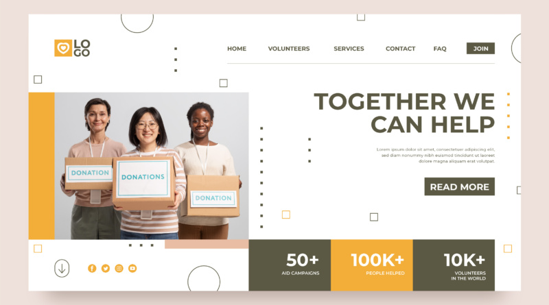
How To Support Your Nonprofit’s Mission Online Through Web Design Color Choice
The topic of color and its impact on the sphere of digital communication cannot be discussed as a simple stroke of style and design in the cases of non-profits because color is much more than that. Colors applied to the site may assist in the expression of a mission, building reliability and controlling the behavior of users. Effectively identified and utilized, the color may reinforce the emotional bond between a company and a viewer. It is incorporated into the look of a mission, and it defines how people perceive a brand since their first visit to a location.
For non-profits, the use of color must be intentional. Every color has an implication and coming together in the correct manner, it can assist in making the online presence to feel to be one and allows the online presence to feel unified, welcoming and in tune with the purpose of the organization. When most of the visitors tend to decide on an impression in a short period, the right color choice can be viewed as the tone that contributes to effective communication.
Aligning Color Choices With Mission And Identity
The mission of a non-profit organization must lend itself to all elements of being online and including color is not to be excluded. The color used in a web site must signify the work being carried out. E.g., a non-profit, whose mission is dealing with environmental concerns, can rely on greens, earth colors to signify nature and environmental sustainability, whereas an organization operating in the area of healthcare can deploy blues that will signify trust, coolness. Such associations are useful in reinforcing the message and values of the organization by a single look.
Other than alignment with the mission, color must facilitate the visual identity of the organization. Most non-profits already have a logo or brand palette and this should continue with their website. The use of primary and secondary brand colors through-out the site gives the sensation of a cohesive experience. When it is done effectively the visitors can easily identify the brand and develop the feeling of familiarity and confidence. This uniformity is critical because it is vital in the case of web design for nonprofits where credibility and transparency are the key elements of creating long-term bonds.
Creating Emotional Impact Through Color
Colors can raise emotions and cause decisions. The non-profits tend to use emotional appeal to raise awareness among people to make contributions through donations or by volunteering or advocating their cause. These emotional reactions can be boosted by the appropriate use of colors to tell the story. Energetic warmer colors such as red and orange can create a sense of urgency and this could be useful when the campaign runs close to the target, or when one is requesting funds. The cooler tones, like blue and purple, can make the atmosphere be more gravitative and reassuring.
Non-profits can take advantage of the lessons about the influence of various colors on mood and build a pattern to stimulate a particular reaction. As another instance, one can use a bright color of a call-to-action button placed on a neutral background so that it stands out within the web page and is clicked on more. Such design choices are included in a wider attempt to utilize the site not only as a source of information but indeed as a means of participation. Such considerations of color are very helpful on nonprofit websites; since they move people to do something useful on the web.
Improving Readability And Accessibility With Contrast
Although color is a very helpful designing tool, it has to be functional as well. It is important that it has readability and access, and the color used should be able to suit everyone who might be using it. This also includes ensuring proper contrast between text and background is in place that enables reading the text easily even by people with visual impairments. Inadequate contrast may result in disillusion and segregation, both of which are counteractive to the non-discriminatory values promoted by most non-profits.
It is also important that designers understand how the color would look under various devices and various lighting situations. What is perceived to be good on the desktop screen might not be so good, on the mobile device outside. Using available design tools and testing the combination of colors with different conditions, non-profits will ensure that their web-site can be used by all people. In nonprofit web design, accessibility certainly cannot be considered as an added bonus, it is an essential ingredient in making a friendly and fair online environment.
Directing User Attention And Guiding Behavior
Visual hierarchy can be achieved with the help of color and users can be guided through a site. Deliberate adoption of accent colors will help highlight the important areas like donation buttons, sign-up forms or event promotion. The path shown to the visitors should allow them to take a definite direction towards the site involvement. This renders color to be a powerful means to facilitate organizational objectives.
Additionally, the use of bold colors or the use of other contrasting colors should not be used excessively since they may suppress the performance of the users. The usage of a balanced color scheme where every element has a specific color assigned to it, i.e., a color used to make headings, a color used to emphasise links and another color to emphasise buttons serves to keep a site organized. Good websites for nonprofits should aim to educate, impress and encourage the viewer, a clean and sensible color scheme contributes to it being the case with each viewer.
Conclusion
Color is not solely a choice of design, but it is also a method of communication that may assist and demonstrate the mission of a non-profit online. Color can be a powerful tool to increase engagement and lead toward a positive action when it is applied in conjunction with brand identity, when it is emotionally connected, and when its application is easy to access. Considered when utilized in a nonprofit web site, or even a more wholesale web design of nonprofits in general, a well-planned color scheme is more successful and effective online. With a suitable palette and strategy, non-profits can transform the websites into works of interconnection and transformations.