
The Art of Luxury Watch Design: How OMEGA and Breitling Master Visual Storytelling
In the world of luxury watches, visual communication isn’t just about aesthetics, it’s about conveying decades of heritage, precision engineering, and brand identity through every design element. Two brands that have mastered this art are OMEGA and Breitling, each telling distinctly different stories through their visual language.
OMEGA: The Language of Space and Sea
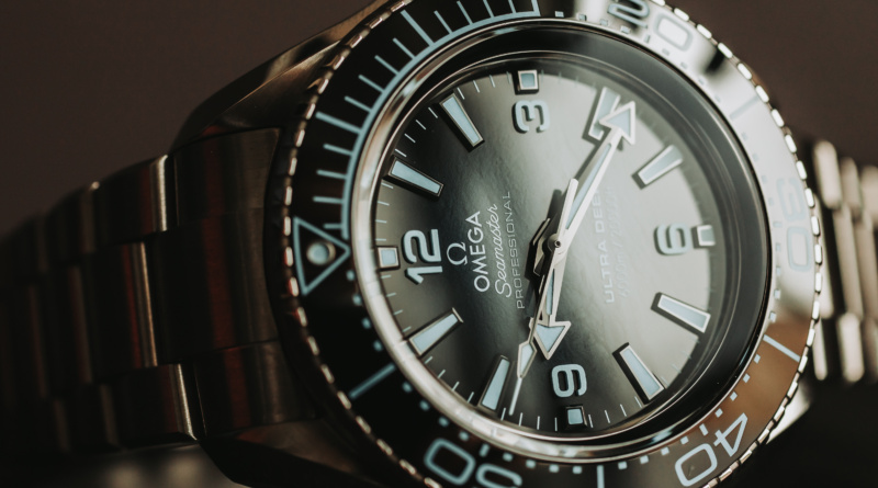
OMEGA’s visual identity speaks fluent sophistication. The brand’s design philosophy centres on clean lines, purposeful functionality, and subtle references to their legendary achievements. Take the Speedmaster Professional, its black dial, white markers, and tachymeter bezel aren’t arbitrary design choices. They’re visual cues that immediately communicate precision, space exploration, and professional capability.
The brand’s colour palette deliberately emphasises contrast and readability. The iconic orange elements on many Speedmaster models aren’t just striking, they serve as functional design elements that enhance legibility while nodding to NASA’s safety protocols. This is visual storytelling at its finest: every element serves both form and function.
OMEGA’s case designs follow what designers call “purposeful minimalism.” The OMEGA Seamaster collection exemplifies this approach, with wave-pattern dials that subtly reference the ocean without being literal. The visual metaphor works because it’s sophisticated rather than obvious, the kind of design choice that separates luxury from mere expense.
Breitling: Aviation-Inspired Visual Identity
Breitling takes a different approach to visual communication, drawing heavily from aviation heritage to create instantly recognisable design language. Their signature is complexity with purpose, multiple subdials, detailed bezels, and instrument-inspired layouts that mirror cockpit aesthetics.
The brand’s visual vocabulary includes specific design elements that serve as immediate brand identifiers. The distinctive “onion” crown, the intricate bezel graduations, and the substantial case proportions all communicate serious professional capability. These aren’t decorative choices, they’re visual statements about the watch’s intended purpose and the wearer’s appreciation for technical excellence.
Breitling’s colour strategies are bold and purposeful. The yellow accents on many Breitling Navitimer models aren’t just eye-catching, they mirror aviation instrument colour coding, creating an immediate psychological connection to professional aviation. It’s visual communication that works on multiple levels simultaneously.
The Psychology Behind Luxury Watch Design
Both brands understand that luxury watch design operates on psychological as well as aesthetic levels. The visual elements must communicate exclusivity, reliability, and heritage simultaneously. This requires sophisticated understanding of how different demographic groups interpret visual cues.
Professional buyers respond to functional design elements that suggest capability and precision. Collectors look for visual references to heritage and manufacturing excellence. Fashion-conscious consumers want striking aesthetics that photograph well and make statements. The most successful luxury watch designs satisfy all these requirements simultaneously.
Modern Challenges in Watch Design Communication
Today’s luxury watch market presents unique visual communication challenges. Digital photography and social media have changed how watches are perceived and shared. Designs must work equally well in person and in photographs, under various lighting conditions, and at different scales.
Both OMEGA and Breitling have adapted their visual strategies accordingly. Dial textures that photograph beautifully, case finishes that remain striking in various lighting, and proportions that work well in both wrist shots and detail photographs. This isn’t accidental, it’s deliberate visual communication strategy.
The Investment Perspective
From a collector’s standpoint, visual design elements often determine long-term value retention. Pre-owned luxury watches with distinctive, well-executed design languages tend to maintain their appeal across different market cycles. Both OMEGA and Breitling have established such strong visual identities that their pieces remain recognisable and desirable decades after production.
The secondary market validates successful visual communication. Watches with clear, distinctive design languages command premiums because buyers can immediately identify quality and authenticity. This creates a feedback loop where strong visual design directly translates to sustained market value.
Conclusion: Design as Communication Strategy
The success of OMEGA and Breitling demonstrates that luxury watch design is ultimately about communication strategy. Every visual element, from dial layout to case proportions to colour choices, contributes to a broader narrative about the brand, the wearer, and the relationship between them.
Understanding this visual language helps both collectors and casual buyers appreciate the sophistication behind seemingly simple design choices. Whether you’re drawn to OMEGA’s space-age minimalism or Breitling’s aviation-inspired complexity, you’re responding to decades of refined visual communication strategy.
The best luxury watch designs don’t just tell time, they tell stories through carefully crafted visual languages that speak directly to our aspirations and identities.