
The Language of Design: How Visual Elements Communicate Beyond Words
Design shapes how we understand the world long before we read a single word. Our eyes notice color, shape, and movement in an instant, and these signals guide our attention without any effort on our part. A simple icon can explain an idea faster than a full sentence. This is why design is often seen as a language. It communicates through layout, contrast, spacing, and form, and it can share meaning even when no text is present.
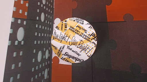
Stickers are a perfect example of this kind of visual communication. They use a very small space, yet they can express identity, emotion, or information clearly and memorably. A sticker on a laptop or a water bottle often tells you something about the person who placed it there. You understand its message right away because the design speaks for itself. This becomes even clearer when you look at stickers, which rely on strong visual cues to make a message easy to recognize. In this way, everyday objects become small storytelling spaces, showing just how powerful simple visuals can be.
How Visual Elements Communicate on Their Own
Design uses basic elements that act almost like the alphabet of visual language. When we understand how each one works, we can create designs that feel natural and easy to follow.
- Color
Color sets the tone before anything else. Red feels urgent and active. Blue feels calm and trustworthy. Yellow feels warm and friendly. These emotions come to us without explanation. In sticker design, color choices can help a message stand out or support the mood of a brand. A soft pastel palette feels gentle. A bold neon palette feels energetic. Each choice tells the viewer what to expect, since people associate certain colors with certain traits.
- Shape
Shapes guide the way people respond to a design. Circles feel friendly and open. Squares feel stable and balanced. Sharp angles feel strong and direct. When we use die-cut stickers, the shape becomes a part of the message. A rounded badge can feel welcoming. A sharp geometric cut can feel modern and bold. Even before the viewer reads any text, the shape has already spoken.
- Typography
Typefaces also have their own tone. Clean sans-serif fonts feel modern and simple. Script fonts feel warm or personal. Bold fonts feel confident. Since stickers often use short phrases or a single word, the type has to be clear and expressive at the same time. Choosing the right typeface can change the entire impression of a design, even if the words stay the same.
- Hierarchy and Size
Hierarchy helps people understand what to look at first. Larger elements speak first. Smaller elements follow. A good hierarchy keeps a design clear and easy to understand. Stickers have limited space, so hierarchy becomes even more important. The main idea should be the first thing the eye notices. Everything else should guide the viewer gently, without crowding the space.
- Imagery and Icons
Icons and simple illustrations help communicate fast. A heart, a star, a leaf, or a camera icon can explain a message instantly. Many vinyl stickers use symbols or minimal drawings because they are easy to understand at a glance. In visual communication, clarity always wins.
Why Physical Objects Still Dominate Visual Communication
The world has become digital-first, but that doesn’t mean physical objects have to take a backseat. They still carry strong communicative power due to the combination of function, form, and familiarity. Screens cannot quite replicate this. With a well-designed object, you won’t just provide information; you will create an intuitive understanding.
This is especially clear if you ever look for Cool Things to 3D Print. Everyday objects can be reimagined into functional designs. Physical pieces can communicate ideas right away, without needing an explanation. It reinforces the idea that design language is at its strongest when people have a tangible experience.
Why Stickers Are a Good Example of Visual Language
Stickers show how strong visual language can be. They use very little space, yet they can express identity, emotion, or information clearly and memorably. Because the space is so limited, every design choice carries weight. Color sets the mood, shape guides perception, type keeps the message readable, and imagery delivers meaning at a glance. When these elements work together, a sticker becomes a perfect example of how design can speak quickly and honestly without relying on long explanations.
This clarity is why stickers work so well on water bottles, laptops, packaging, or event materials. People can recognise a sticker’s message in seconds because the design is simple, intentional, and easy to understand. A good brand sticker can show personality or purpose with only a few visual cues. It can even stay in someone’s memory long after they see it. This proves how powerful focused visual language can be. When designers remove what is unnecessary and highlight what truly matters, even the smallest design becomes an effective communication tool.

Using Visual Language Effectively
Designers can strengthen their visual language by taking a simple and intentional approach. Start with the main message you want people to feel or understand. This becomes the anchor for every choice you make. Once the message is clear, choose colors and shapes that support it rather than compete with it. Each element should guide the viewer toward the idea, not pull them away from it.
Keep the layout clean and remove anything that does not add meaning. Extra lines, unnecessary icons, or decorative elements can make the message harder to read. Clarity should always come first. After shaping the layout, test whether the design is easy to understand at a glance. We follow this same practice when reviewing sticker mockups. If the idea is clear right away, the design is moving in the right direction.
Small adjustments can make a big difference. A slight color shift, a change in type size, or a bit more spacing can help the message land with more confidence. When designers pay close attention to these details, their visuals become more intentional, more readable, and more meaningful.
The Smallest Designs Often Speak the Loudest
Visual language is everywhere. It shapes how people respond, understand, and remember what they see. Stickers show this power in its simplest form. With just a few carefully chosen elements such as color, shape, type, and imagery, they deliver messages that feel immediate, clear, and honest. Even in a small space, thoughtful design communicates meaning far more effectively than words alone.
When we design with intention, we help people understand more with less. Every choice, no matter how small, contributes to clarity and impact. Stickers are a reminder that effective visual communication does not need to be complicated to be powerful. Whether you are creating brand visuals, exploring logo psychology, or designing stickers that speak for your identity, the same principles apply.