
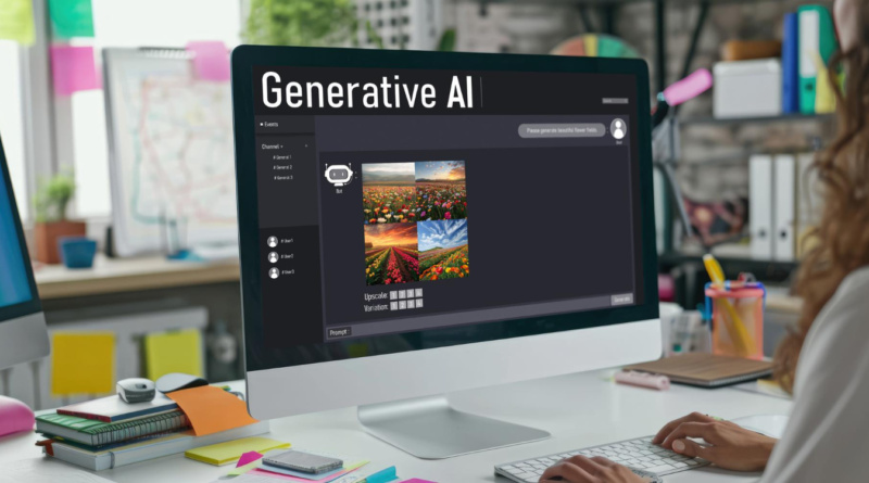
From Rough Draft to Polished Visual Content with AI
A rough draft rarely looks like the finished thing. It’s usually a pile of half-formed ideas, scattered notes, maybe a photo of a whiteboard from a meeting three weeks back. Somewhere between that mess and a clean infographic or presentation slide, someone has to figure out what matters, what doesn’t, and how to say it so a stranger gets it in five seconds instead of five minutes.
That used to take hours. It still can, honestly, but AI has cut a lot of that time out — mostly by taking over the boring parts. Sorting information. Finding structure in messy notes. Giving a rough sense of what a concept might look like once it’s drawn out.
When the Draft Starts as a Photo, Not Text
Here’s the thing though: a lot of source material isn’t typed at all. It’s a photo. A textbook page, a handwritten equation, a diagram someone snapped a picture of on a whiteboard before it got erased. Turning that into something usable for a slide used to mean sitting down and retyping the whole thing by hand, hoping nothing got lost in translation.
That’s more or less the gap GetSolved.ai fills. Found by getsolved.ai, the tool reads tasks submitted as photos and turns them into clean, explained text — then checks that text for grammar issues, scans it for plagiarism, and fact-checks the claims before it’s ready for the next step. Small distinction, but it matters. More people now run written content through an ai detector before they trust it, and an explanation that shows its work tends to survive that kind of check better than one that just states a conclusion and moves on.
Why Rough Material Rarely Survives Contact With an Audience
Most drafts fail as visuals for a few of the same reasons, over and over.
Too much information with no hierarchy is the big one. Every point looks equally important, so nothing stands out. Close behind that is the loss of relationships between ideas — a cause-and-effect chain gets flattened into a bullet list, and the logic disappears somewhere along the way. Language gets inconsistent too. Notes taken across several sessions rarely use the same terms twice, which confuses anyone reading them cold. And there’s the audience problem: a draft written for the person who made it doesn’t automatically make sense to anyone else.
None of these are really visual problems, if you think about it. They’re thinking problems that happen to show up on the page. Which is where AI tools have turned out useful — less a design shortcut, more a way to sort out the thinking before anyone draws a single shape.
Where AI Actually Helps
AI writing and reasoning tools are decent at one specific kind of labor: taking something disorganized and handing it back in a shape a person can work with. Ask a model to summarize a page of notes, and it’ll usually pull out the two or three ideas that matter most. Ask it to explain something back in plain language, and gaps in the original thinking tend to show up fast — sometimes faster than you’d like.
Once the underlying idea has been checked and stated clearly, the visual part gets a lot easier. A chart, a diagram, a slide — there’s no ambiguity left about what it’s supposed to say.
From Notes to a Finished Visual: What Actually Changes
Here’s a rough breakdown of where manual work tends to stall, and what shifts once AI enters the picture.
| Stage | Manual Approach | AI-Assisted Approach |
| Gathering source material | Retype handwritten or photographed notes | Extract and interpret text/images directly |
| Identifying key points | Read through everything, guess at priorities | Summarize and rank ideas by relevance |
| Structuring information | Trial and error with outlines | Suggest logical groupings or sequences |
| Choosing a visual format | Based on habit or guesswork | Matched to the type of relationship (process, comparison, hierarchy) |
| Drafting the visual | Build from scratch | Generate a starting layout to refine |
| Reviewing for clarity | Ask a colleague, or guess | Test explanations against a plain-language rewrite |
Same story in every row. AI eats the mechanical bottleneck so more time can go toward the judgment calls a person has to make anyway.
A Practical Workflow
This sequence works reasonably well for turning scattered material into something presentable, whether the goal is a class presentation, a report, or a marketing one-pager.
- Dump it all together — typed notes, photos of handwritten pages, screenshots of a textbook, whatever exists.
- Run image-based material through a solver tool first. If part of the source is a photo of a diagram or a math problem, get a clean, explained version before touching anything else.
- Summarize and prioritize. Ask an AI assistant to name the two or three central ideas, and set aside whatever doesn’t support them.
- Pick a visual format that fits — a timeline for a sequence of events, a flowchart for a decision process, a comparison table for, unsurprisingly, a comparison.
- Draft, then simplify. First attempts at a visual are almost always too busy. Cutting elements beats adding them nearly every time.
- Check the final version against what you meant to say. Did it survive the process, or did something quietly get lost along the way?
People skip step two more than any other, and it’s usually the mistake that costs the most time. Someone spends twenty minutes manually transcribing a photographed diagram when a solver tool could hand back a usable explanation in under a minute.
A Short Look at the Tools Involved
Different tools cover different parts of this process, and none of them do everything. Picking the right one depends on where you’re stuck.
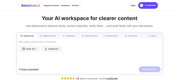
GetSolved.ai reads tasks and problems from uploaded images and returns a worked explanation rather than a bare answer, which makes it a solid first step when the source material is photographed rather than typed. It handles image input directly and explains its reasoning instead of just handing over a result, across a wide range of subjects. What it isn’t is a design tool, so whatever comes out of it still needs shaping into something visual afterward. There’s a free tier, with paid plans for heavier use.
Canva’s AI features sit at the other end of the workflow. The template library is huge, it’s easy to pick up, and it’s a fast route to polished output — though the suggestions can feel generic until someone goes in and tweaks them by hand. Free tier available; Pro plans run around $13 a month.
Visme was built specifically for infographics, charts, and presentations, with some AI content generation built in. Strong on data visualization, a good fit for structured reports, but it takes longer to learn than simpler tools. Free tier available, paid plans typically starting near $29 a month.
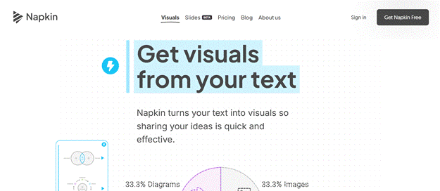
Then there’s Napkin AI, which converts written text directly into diagrams and visual concepts. Quick way to get a paragraph into a first-draft diagram, though customization is limited next to a full design platform. Free tier, paid plans for expanded use.
Run roughly in that order — solver, then summarizer, then design tool — and together they cover gaps a single app can’t handle alone.
Why This Matters Beyond Convenience
There’s an argument for AI-assisted visual work that goes past saving time. Good visual communication depends on understanding the material first. Nobody builds a useful diagram of something they don’t get. Checking, simplifying, and restructuring a rough idea before it turns into a graphic often does more for comprehension than the finished visual ever will.
That part gets overlooked a lot. Concept visualization forces precision, since a fuzzy idea can’t survive being turned into a labeled diagram without the fuzziness showing up somewhere. AI tools that clarify a concept before the visual stage end up doubling as teaching tools, not only production ones. Visual storytelling — a slide deck, an infographic, whatever form it takes — tends to land better when whoever built it understands what they’re representing, instead of stretching a template over a topic they only half-get.
Bringing It Together
None of this replaces judgment. AI can summarize notes, work through a photographed problem, or suggest a layout. It can’t tell you what a particular audience needs to see first, or whether a chart is being honest with the data behind it. Those calls belong to whoever’s doing the work, full stop.
What AI changes is the distance between a messy starting point and something usable. Fewer hours go into transcription and guesswork; more go into the decisions that shape how well an idea lands. Anyone who regularly turns notes, screenshots, or half-finished drafts into something presentable will recognize that shift. Not a flashier visual, necessarily. Just a shorter, less painful way to get to one.