
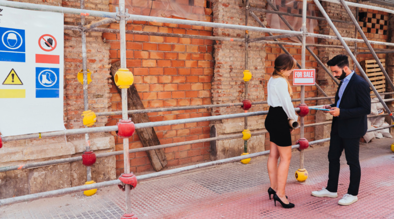
What Construction Site Signage Gets Right About Information Hierarchy
Construction site signage is designed around a single priority, getting the most urgent piece of information into a passer-by’s head before they’ve had time to think about it. A driver slowing past a road closure needs to read a board in a second or two, often from a moving vehicle. That constraint forces a kind of visual discipline branded environments rarely need.
For anyone who studies how information gets organised on a page, that discipline is worth a closer look. Every hoarding, hazard board and directional sign on a site follows rules that have nothing to do with taste and everything to do with what the eye needs to find first. Colour, size, position and repetition each do a specific job.
Colour Does the First Sorting
Colour is read before anything else on a construction sign, which is why the palette barely changes from one site to the next. Red marks an immediate hazard, amber flags caution, blue tells people what they must do, and green points to safe routes or first aid. None of this depends on the words underneath being read first. A driver going past at speed picks up the colour and reacts before the message is consciously processed, buying the half-second that text alone can’t.
Where the Materials Come From
Part of the reason this system holds together across unconnected sites is mundane. The materials come from the same small pool of suppliers. Standard hazard signs, barrier tape, spray marking paint and PPE labelling are stocked alongside timber, blocks and scaffold fittings at professional builders merchants, so a site manager in one county buys the same red-white tape and yellow triangle boards as a contractor two hundred miles away. Nobody redesigns the hierarchy for each job. They pick familiar products off a shelf, and that repetition keeps the system legible to the public.
Size and Placement Decide What You Read Next
Size and placement handle the next stage of sorting once colour has done its job. The biggest boards sit at entrances and at the point a hazard begins, roughly at eye height on foot or windscreen height in a vehicle. Secondary information, site rules, contact numbers, gets smaller lettering lower down. Jock Kinneir and Margaret Calvert used the same logic when they widened the letter spacing on the typefaces they built for Britain’s road signs, so words stayed legible at speed.
A construction site follows the same logic on a smaller scale:
- The most urgent hazard warning sits at the entry point, sized to be read without stopping
- Mandatory PPE instructions repeat at eye level at every access point
- Site rules and contact details sit lower, away from the primary warning
The Discipline Isn’t Confined to the Site
The same hierarchy logic turns up wherever people need to find their way through a big, unfamiliar space under time pressure. When the Victoria and Albert Museum in London commissioned a new wayfinding system for its seven miles of gallery space, the studio behind it worked from the same starting point as any site foreman, deciding what a visitor needs to know first. A hazard board and a museum floor plan share that same job, since the reader never has to work out what matters most once the layout has already decided for them.