
Designing Messages People Can Actually Scan: Applying Visual Hierarchy to Busy Group Chats
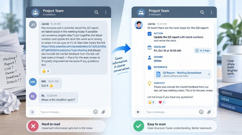
A message can contain everything the reader needs and still fail to communicate.
It happens every day in busy group chats. Someone posts a meeting time, a new deadline, three action items, a link, an ownership change, and several lines of background—all in one dense paragraph. Technically, the information is there. Practically, everyone has to hunt for it.
That is not simply a writing problem. It is an information-design problem.
People rarely approach chat messages as if they were reading a report from beginning to end. They scan for names, dates, actions, warnings, links, and anything that tells them what happens next. Even inside a plain messaging interface, spacing, sequence, emphasis, and labels create a visual hierarchy.
The goal is not to make chat prettier. It is to make the important information easier to find.
Chat Messages Need Hierarchy Too
Designers use size, contrast, spacing, alignment, and position to tell viewers where to look first. A messaging app offers fewer visual tools, but the same principle applies.
For many work messages, a useful order is:
Action → Time → Detail → Reference
Consider this update:
“After speaking with the client this morning and going through their comments from yesterday, could everyone please review the latest report and send feedback before Friday at 3 PM? The spreadsheet is in the shared folder.”
Now compare it with:
ACTION: Review the latest report
DEADLINE: Friday, 3 PM
DETAIL: Focus on the client comments from yesterday
REFERENCE: Latest spreadsheet in the shared folder
The information has barely changed. The reading experience has.
The second version allows someone opening the message between meetings to understand the task almost immediately.
Put the Action Before the Backstory
Writers often start with context because that reflects the order in which they experienced the situation. Readers usually care about a different order: what changed, what they need to do, and when they need to do it.
A message such as:
“After reviewing the remaining changes with the project lead, we think it would be helpful if the design team could update the presentation by Thursday.”
makes the reader wait for the point.
A clearer version is:
ACTION: Update the final presentation by Thursday.
Then add the background:
The remaining changes were confirmed with the project lead today.
Context still matters. It simply does not always deserve first place.
Use Formatting as Contrast, Not Decoration
Modern messaging apps provide more formatting options than many teams actually need. Telegram, for example, supports bold and italic text, underline, strikethrough, spoilers, quotes, code-style text, and descriptive text links.
The important question is not whether formatting is available. It is what each treatment communicates.
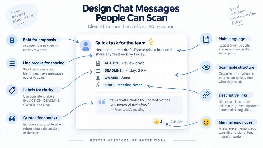
Use bold for something that genuinely deserves first attention: a deadline, decision, action, or warning.
Use italics for secondary emphasis rather than competing with the main point.
Use quote formatting when the reader needs to see the exact statement being answered.
Use code-style formatting for filenames, commands, technical values, or short strings that need to remain visually distinct.
Traditional Chinese readers in Hong Kong or Taiwan who want platform-specific examples can refer to an 電報訊息排版指南, but the larger principle is platform-independent: emphasis works only when it is selective.
If half the message is bold, bold has stopped meaning anything.
Line Breaks Do the Work of White Space
In visual design, empty space is not wasted space. It separates elements and helps the eye recognize groups.
Line breaks perform much the same function in chat.
Compare:
“Meeting tomorrow at 10 AM please review the draft before joining Anna will present the updated numbers and here is the call link.”
with:
MEETING — Tuesday, 10 AM
Before: Review the draft
Presenter: Anna
Topic: Updated numbers
Link: Meeting call
The second version is longer vertically, but faster to understand.
This is also why six consecutive one-line messages are not automatically clearer than one well-structured message. A phone buzzing six times for a single update creates interruption without adding structure.
Short is useful. Chunked is better.
Labels Give Messages a Job
Group chats often mix several kinds of communication in the same stream: questions, updates, decisions, tasks, and information that requires no response.
Simple labels help readers understand what kind of attention a message needs.
Useful examples include:
ACTION
DECISION
QUESTION
FYI
DEADLINE
UPDATE
For example:
UPDATE: The launch has moved to September 18.
ACTION: Replace the old date in all customer-facing materials.
OWNER: Marketing team.
DEADLINE: Wednesday, noon.
The labels behave like miniature headings. A reader does not need to interpret the whole paragraph before discovering its purpose.
Quote Only the Context You Need
Replying to an earlier message is useful when several conversations are happening at once. Quoting too much has the opposite effect.
If the question is:
“Should we move the launch to Friday?”
the reply needs that sentence—not the entire previous project update.
Longer reference material can be separated from the main point with a quote block. Telegram also supports collapsible quotes, which can keep optional background available without forcing every reader to scroll through it.
This is especially useful for meeting notes, technical logs, previous decisions, or lengthy source material.
The main message stays visible. The detail remains available.
Give Links Meaning Before the Click
A raw URL makes the reader do extra work. They have to inspect the address, remember the surrounding sentence, or open it without knowing exactly what it contains.
Descriptive links remove that uncertainty.
Instead of: https://example.com/document/87291/latest
use language such as:
Project Brief
Updated Schedule
Meeting Notes
Final Assets
File naming deserves the same attention.
“final-v7-new2.pdf” tells a colleague very little.
“Q3 Campaign Brief — Approved.pdf” tells them what the file is before they open it.
Good labels reduce both hesitation and mistakes.
Emoji Can Work Like Icons—Until They Become Noise
Emoji can create fast visual cues when a team uses them consistently.
???? can identify a date.
✅ can indicate completion.
⚠️ can signal attention.
????can point to an attachment.
But they should support meaning rather than carry it alone.
A warning still needs to explain the problem. A deadline still needs an actual date. International teams should be especially careful about assuming that every symbol, joke, or reaction has the same meaning across cultures.
The test is simple: would the message still make sense if the emoji disappeared?
If not, the text is probably doing too little.
Plain Language Beats Clever Formatting
Formatting can guide the eye, but it cannot rescue vague writing.
“Please action the deliverables pursuant to our earlier alignment” remains difficult even when the sentence is beautifully formatted.
“Please send the final slides by 3 PM” is clearer because the verb, object, and deadline are explicit.
Useful group-chat writing favors concrete verbs, recognizable names, precise dates, and shorter sentences. It avoids unnecessary jargon and explains acronyms when the audience may not know them.
The visual layer reduces scanning effort. Plain language reduces interpretation effort.
Both matter.
Design the Message Around Its Purpose
Not every message should follow the same template.
A task should make the action obvious.
A meeting notice should surface the date and time.
An update should begin with what changed.
A decision should state the final outcome.
A warning should reveal the risk quickly.
A technical instruction should make the required command or step easy to locate.
The common mistake is writing information in the order the sender thought about it. Better communication arranges it in the order the recipient needs it.
Make Multilingual Messages Easier to Decode
Teams working across English and Traditional Chinese—or any combination of languages—have another layer of friction to manage.
Long idiomatic sentences can be harder to translate or interpret. Relative dates such as “tomorrow afternoon” can also become unclear when teams operate across time zones.
A few habits help:
- Use explicit dates and times.
- Keep product and file names consistent.
- Separate instructions from background.
- Avoid unnecessary idioms.
- Keep important terminology stable across messages.
- Do not rely on emoji alone to communicate urgency.
For teams applying these ideas in Telegram across desktop and mobile, a Telegram message formatting guide can provide platform-specific reference points. The larger objective, however, is not formatting for its own sake. It is lowering the effort required to identify what matters.
Try the Five-Second Test
A useful way to improve team messages is to audit one real example.
Take a long update and ask:
- What is the action?
- Who owns it?
- What is the deadline?
- What changed?
- Which information is optional?
- Which link actually matters?
Then restructure the message around those answers.
If possible, show the revised version to someone who was not involved in writing it. Give them five seconds and ask two questions:
What are you expected to do?
When does it need to happen?
If they cannot answer, the message probably still has a hierarchy problem.
Before pressing send, check whether the important action is visible, the deadline is easy to find, formatting is restrained, separate ideas have enough space, and every link explains where it goes.
The best-designed chat message is rarely the most elaborate one.
It is the one that lets the reader understand priority, context, and next steps without having to reconstruct the message themselves.
Visual hierarchy is not limited to posters, presentations, websites, or reports. The moment a chat message contains competing ideas, dates, links, and responsibilities, it becomes a small information-design problem.
Treat it like one, and people will not merely read faster. They will have fewer opportunities to misunderstand what you meant.