
Information Design Rule: Create for How People Feel
World renown cognitive scientist Donald Norman—author of Emotional Design: Why We Love (or Hate) Everyday Things—once made a profound argument: “The emotional side of design may be more critical to a product’s success than it’s practical elements” (5). Basically, how people feel about what they are using may be more important than how well the thing actually works. While Norman primarily made the argument for physical objects like teapots, lemon squeezers, and Mini Coopers, the same argument can be made for information: if people like how it looks and they enjoy engaging with it, they are much more likely to read and use it. If a document (or an email or a billboard) feels boring, cumbersome, untrustworthy, or even just ugly, people are less likely to access it and use it.
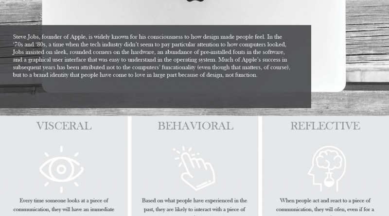
The first chapter to Norman’s book is entitled, “Attractive Things Work Better.” As an information designer, you want to be cognizant if what you create will look attractive to the people using it. If you can master that, you’ll be much more likely to get people to engage with it. Norman suggested that people have three different emotional responses to designs, all of which come from different parts of our cognitive responses: the visceral, the behavioral, and the reflective. When you design information, try to reach your audience by tapping into all three.
Visceral
Visceral reactions to designs are immediate, primarily biological and mostly impulsive reactions to what we see. While many visceral reactions to what we see are universal (if we see something sharp, we know it will hurt), the visceral part of the brain can also be trained somewhat through experience. After enough exposure, for example, people immediately recognize things like the color red to mean “warning” or “stop.” Note that people in the 21st century have a great deal of experience with design—even if they’re not real conscious of it—and they will have visceral reactions to colors, fonts, and layouts that immediately strike them as “ugly,” “unprofessional,” “sexy,” “sleek,” or any other descriptor. What can you do make something visually appealing, attractive, and, therefore, more likely to be meaningful to your reader?
Behavioral
Behavioral reactions to designs are not conscious, but they are learned and improved over time. When people see a door handle, they feel compelled to pull rather than push because experience has told them that an outward handle means the door will pull towards them. People using a website may subconsciously scroll through a page or click on blue underlined text because they have learned what typically scrolls and links. Any time we design information, people will react to it based on how their experience has trained them. Consider what people will subconsciously assume is a link, a button, a fillable text field, or a caption; is what you are creating obvious and easy to use and does it meet their expectations?
Reflective
Reflective reactions to information refer to when people think about and respond to what they just did or saw. If people are attracted to a design (visceral) and they use it in ways that they expect or that are enjoyable (behavioral), they are likely to reflect on the experience as being “simple” or “fun” or “worthwhile.” But if what they experience doesn’t meet their expectations, their reflection may drum up emotions like “confusing,” “dull,” or “frustrating.” Note that every time someone interacts with your information, they most likely have a reflective moment, even if incredibly brief. If they delete your email before reading it, it’s likely because they reflected on certain properties of it that said, “not important.”
When designing information, be conscious of your users’ visceral, behavioral, and reflective reactions to what you create. Will it speak positively to them? Will they know how to use it? And…what will they think of it during or after they’re done using it?