
Is COVID-19 Really that Deadly? A Visual Guide to the Numbers that Matter
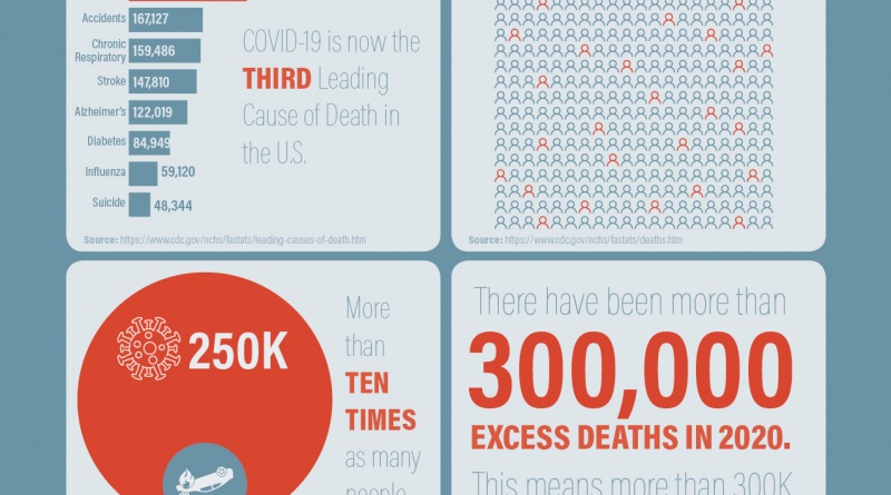
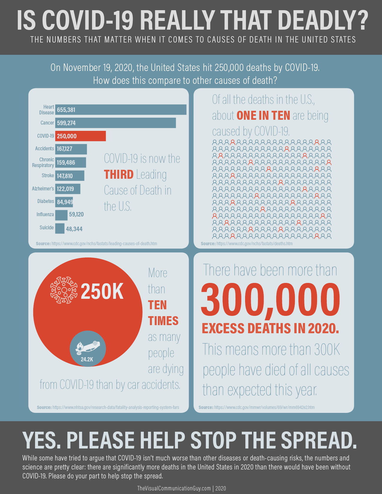
Yesterday, I read an article published by CNN that touted this headline: “COVID-19 has killed 250,000 people in the U.S. That’s 10 times the number of deaths from car crashes in a year.”
The CNN authors’ comparison to car crashes is designed to offer perspective. At a time when people all over the globe are frustrated, confused, scared, or angry about mask mandates, testing protocols, and whatever else, perspective and accurate information is what we all really need.
Politics aside, it seems like the number one question average, thoughtful people are asking is, “Is this all just a bit of an overreaction, or is COVID-19 really that much worse than other health concerns or typical risks?”
That question seems to be at the root of many of the debates I’ve heard, often leading to a second, misinformed argument: We take risks every time we get in a car or plane, too! And there’s always been a risk of getting the flu or pneumonia—which also kill a whole lot of people—every time we go outside. We’re all willing to take those risks. Can’t we live life like normal and assume the COVID risk?
The problem with that argument is that it doesn’t seem to recognize the data point that really matters: excess deaths. That is, the number of deaths that happen in a year that are in excess of what is normal or expected. The CDC can typically guess, based on historical averages, how many people will die each year from heart disease, cancer, diabetes, etc. Excess deaths really show the burden of a disease on a society. And, in 2020 as reported by the CDC, we have already exceeded 300,000 excess deaths, much of which can be attributed directly to COVID-19.
Again, making things clear to people—average, non-scientific, non-medical professional humans—often requires putting abstract data into perspective. Visualizing the data can draw attention to numbers and information in ways that traditional text-based and numerical-based data can’t.
With that in mind, here is a visual guide to understanding just how serious COVID-19 actually is. All data for this graphic is drawn from the CDC and NHTSA.gov. Hopefully it puts some perspective on the numbers so that we can all take the virus serious, especially as we approach the winter and holiday season.
My boss emailed out your first covid infographic that included the quote “most indications are that the flu appears to be a far greater threat than COVID-19” as proof that continuing to travel and proceed with business as usual is a good idea. I’m glad you took that down and are now posting things like this.
Thanks for the thoughtful comment. Much has been learned since late February/early March. That first graphic relied on all the best sources: CDC, Johns Hopkins, Attorney General Gerome Adams, and Anthony Fauci. The graphic was informed by and based off of a video created by USA Today. That said, the graphic never suggested that COVID shouldn’t be taken seriously; the prevailing thought was just that we shouldn’t panic (that’s when all the stores’ shelves were being wiped clean) and that was the message of the graphic. Unfortunately, many interpreted the graphic to mean that we shouldn’t take COVID seriously, which was never the intended message. Once I realized people were understanding the wrong message, I immediately removed it–within three days of publishing.