
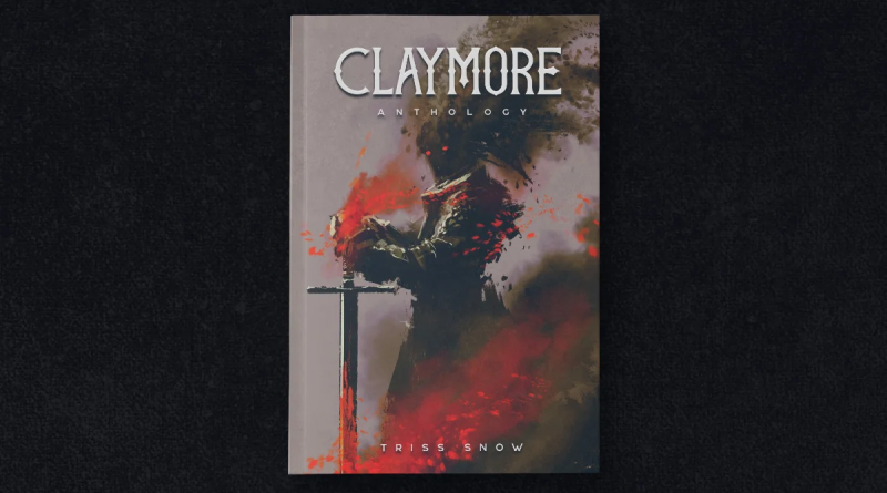
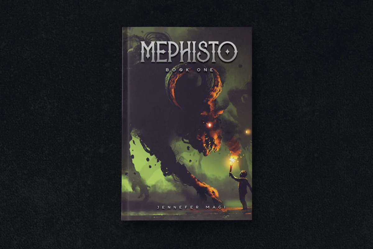
How to Choose Fonts and Design for Your Book Cover
We all know the saying ‘You only get one chance to make a first impression’. It’s true, and your book cover design is no exception.
Your book cover design will tell potential readers what kind of story lies within its pages. It’ll give them ideas about the genre of the book, hinting at its content with fonts, color, and text. It will also make a statement about the quality of writing within, and ultimately whether or not it’s fit for purpose.
So here are some dos and don’ts to help you put together an effective book cover design:
Keep It Legible
If you’re struggling to read the title in a thumbnail size image, then it’s likely that potential readers will have the same problem. Make sure all the text on your cover is legible, no matter what size it is.
Don’t Use Too Many Fonts
It can be tempting to use lots of different fonts on your book cover in order to add visual interest, but this can often be a mistake. Too many fonts can make your cover look cluttered and messy, which will end up confusing potential readers.
Choose a Suitable Font
There are thousands of fonts to choose from, but not all of them will be suited to your book cover. Some fancy fonts are too intricate and will get lost when resized. Others are too plain and boring, or difficult to read.
It’s a good idea to look at other book covers within your genre, and see which fonts they’ve used, because it shows that the publisher knows their audience and what will sell books. It’s also likely that the font they’ve chosen is legible and effective when reduced to thumbnail size. If the font isn’t legible in this format, it won’t help you get your book noticed.
Be Aware of Copyright and Licensing Issues
It’s very easy to search for ‘free fonts‘ and use them on your book cover. However, if the font is free to download, it’s likely that it’s not licensed for commercial use. This means that you could be in trouble if the font’s creator finds out you’re using it without their permission.
It’s always best to buy a font, or use one that’s been licensed for commercial use. This way, you know you won’t run into any problems down the line.
Don’t Use Stock Photos
Stock photos are great for authors who are on a budget, but if you’re serious about selling your book then it’s best to invest in custom images. When using stock photos there’s always the possibility that another author has used the same ones. This will have two effects: it’ll make your book look unprofessional, and it’ll be difficult to stand out from the competition.
Custom images are a great way to show potential readers that you’ve put in the effort, and they’re more likely to pick up a book that looks unique.
Keep It Simple
This is especially important when it comes to book covers. Too much text or intricate designs can be overwhelming, and it’s difficult to know where to look first. Keep your cover simple and focused, with one or two key elements that will grab attention.
Source: CreativeMarket
Think about Your Book’s Theme
If you’re writing a book about space travel, it might not be the best idea to use classic serif alphabet fonts. However, if your story is set in the 1920s then there are plenty of fonts that would suit it perfectly.
There’s nothing worse than seeing a book cover with text that doesn’t fit. If you’re writing about ninjas, witches, and pirates, don’t use formal serif or san-serif fonts – they won’t convey the right mood.
For a wide variety of fonts that would suit an equally wide variety of themes, check out CreativeMarket.
Keep It Consistent
You should also think about how your book cover will look when it’s printed, or used on the spine of your book. You’ll need to find an image that can be cropped to work in both formats, which may require you to use clever design techniques.
Make sure all formatting is consistent throughout your book so that it looks like a professional publication.
Think about the Colors You Use
Color is a powerful tool that can be used to hint at the genre of your book, or to set the tone for the story. For example, if you’re writing a horror novel then it might be a good idea to use dark and brooding colors, or if you’re writing a romance then light and airy colors might be more appropriate.
Keep in mind the effects that different colors can have on readers, and use them to your advantage.
In Summary
When it comes to book covers, there are a few things to keep in mind: make sure all text fonts are legible, choose a suitable font, and keep it consistent throughout. You should also keep in mind your book’s theme, the colors you use, and how they’ll look when printed or used on the spine of a physical copy. With this advice under your belt, you’re well on your way to designing an effective book cover that will draw attention.