
Why Visual Hierarchy Matters More Than You Think for SEO
Every part of your webpage sends a signal. That might sound dramatic, but it’s absolutely true. Before anyone reads even a word of your content, the layout, spacing, and order of things completely shape how the message is received. Visual hierarchy is at the center of that process, and it’s what tells your visitors what’s most important, what to look at next, and whether it’s worth their time to keep scrolling. But it does more than that, as search engines don’t just read your words. They also look at how those words are organized. They pay attention to headings, structure, even how long people stay on the page. So when visual hierarchy is done right, it doesn’t just make your content easier to understand, it also helps it rank. Search engine optimisation and visual communication have a lot more in common than people think. Understanding how they work together can make the difference between content that gets buried and content that actually connects.
Why layout isn’t just about looks
There’s a common mistake that happens a lot with content heavy pages. The focus goes straight to the copy. Keywords, subheadings, meta descriptions. All of that matters, of course. But if the structure around that copy is clunky or unclear, it won’t hold attention for long. A webpage needs to visually guide the reader from the top of the page to the bottom. And that path can’t feel forced. Good visual hierarchy uses contrast, scale, alignment, and spacing to create a sense of flow which is subtle but powerful. A headline should be the biggest thing on the page and subheadings should clearly separate different ideas. Body text needs to be easy on the eyes. These things sound obvious, but they get skipped more often than expected. When layout is overlooked, bounce rates go up. That sends a negative signal to search engines. If people aren’t staying on the page, algorithms assume the content isn’t useful. They don’t know why people leave, they just know that they do. It’s not always the writing that’s the problem. Sometimes it’s the visual structure that’s getting in the way.
How headings help both people and crawlers
One of the most basic but often misunderstood parts of SEO is heading structure. Search engines use HTML tags to figure out the structure of a page. These include H1, H2, H3 and so on. But readers rely on them too, even if they don’t think about it. Headings break up big chunks of text and give people quick context. They help with skimming, which is how most people interact with content online. There’s a kind of rhythm to headings when they’re done right. An H1 should be used once, for the main title. H2s split the page into key sections. H3s and H4s support those sections with more detail. If heading levels are skipped or used inconsistently, it’s harder for both people and crawlers to make sense of the page. That kind of confusion doesn’t just create friction, it makes content harder to rank too. Structure is part of readability and readability affects engagement. If someone clicks on a blog post, then leaves a few seconds later, the algorithm picks up on that as it assumes the page didn’t meet their needs. And maybe it didn’t, but in some cases, the layout just didn’t help them find what they were looking for.
Why visual consistency matters more than ever
There’s a growing emphasis in search on user experience signals. These include how long people stay on a page, how far they scroll, whether they visit other parts of the site. All of that is influenced by visual consistency. Fonts, colours, image placement, padding, line spacing. They’re not random choices, when they’re used well, they help people process information without working too hard. That’s what keeps someone reading. The eyes shouldn’t have to fight to find the next idea- when everything blends together or looks chaotic, readers stop trying. On mobile devices, this is even more critical. A layout that works fine on a desktop might fall apart when squeezed into a smaller screen. If there are too many different font sizes, no spacing between sections, or long paragraphs without a break, the whole thing becomes unreadable.m Consistency doesn’t mean boring, it means reliable. A visually consistent site builds trust as it creates a kind of silent agreement that what you see on one page will be similar to what you see on another. That’s not just good for users, it’s something search engines reward.
Design choices that signal value
There’s a connection between design quality and perceived credibility. Studies have shown that people are more likely to trust a site if it looks professionally designed. That doesn’t mean it has to be flashy. It just needs to feel intentional. Clean layouts, clear spacing, proper use of headings and images, these are all signals that the content has been thought through. That perception of quality influences behaviour. When a page looks valuable, people are more likely to stay longer, click other links, even share it. Those actions increase time on site and decrease bounce rate. Both are positive SEO signals. There’s also the matter of emotional response. A well designed page can feel calm, welcoming and focused. A messy or cluttered page can feel overwhelming, chaotic, or unfinished. These impressions happen fast- in less than a second, people decide whether to trust a page or not. And if that first impression is negative, it’s really hard to recover. Search engines may not judge beauty directly but they definitely do track how people respond. If a page looks polished and easy to navigate, people act differently and those actions help pages rank higher over time. Not every team has the resources or time to rethink the structure of their website from top to bottom. But that’s often what it takes when visual hierarchy and SEO aren’t aligned. For businesses that need support tying these elements together, an expert SEO company can help with the technical and strategic groundwork. It’s less about outsourcing and more about refining what’s already there so it performs better across the board.
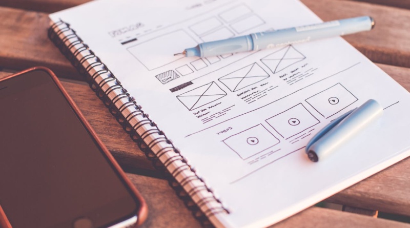
When images help and when they hurt
Images are a big part of visual hierarchy but they only help if they’re placed with care. A random image between two paragraphs doesn’t always add value. If it doesn’t relate to the content or breaks up the flow, it can do more harm than good. Search engines can’t “see” images the way people can. They rely on alt text, file names, and context. So if an image is there just to fill space, it won’t help with ranking. It might even slow the page down, which can hurt SEO. On the other hand, strong images can improve engagement. Charts, diagrams, photos, and illustrations can all support understanding when placed correctly. They create visual breaks that help people digest longer content. But spacing, size, and alignment matter. If an image is too large, it interrupts. If it’s too small, it’s ignored.
Images that follow a clear logic in the layout can reinforce hierarchy. They act as visual signposts. They show what matters and where the eye should pause. That kind of guidance is helpful for everyone, not just for readers, but for crawlers too.
The invisible weight of white space
It’s easy to underestimate how much white space affects content performance. In fact, it might be one of the most powerful design tools when it comes to SEO. White space isn’t empty space. It’s breathing room. It lets the brain take in information without getting overwhelmed. When pages are crammed with dense text, people check out fast. Even if the words are great. Even if the topic is exactly what they searched for. The visual stress is too high. That leads to quick exits, low engagement, poor ranking. White space supports hierarchy by reinforcing the relationship between elements. It separates headlines from paragraphs. It groups related ideas. It gives each part of the page its own territory. That structure improves scanability and makes the entire experience feel more thoughtful.
There’s no formula for the perfect amount of space. But too little is usually worse than too much. Especially on mobile, where spacing plays a huge role in tap accuracy and content flow.
The bigger picture behind hierarchy and SEO
Search engines are constantly evolving to behave more like people. That means old tricks don’t work anymore. You can’t stuff a page with keywords and expect it to rank. The way a page is experienced matters just as much as the content on it. Visual hierarchy is one of the key ways to shape that experience. It tells people where to look first, how to keep moving, and when they’ve reached something important. It creates trust, reduces confusion, and keeps attention in place. And all of that sends strong signals to algorithms as when a layout works well, the content becomes easier to absorb. That means more time on page, more internal clicks, more shares. It also means search engines see the page as useful and relevant. Which is what they’re trying to figure out in the first place. The intersection between SEO and design isn’t always obvious. But it’s there in every heading, every line break, every image, every decision about what goes where. Pages that look good and feel good tend to perform better. Not just with people, but with the machines too.