
Strategic Visual Communication for Modern Music Creators
Before a single note reaches someone’s ears, they have already formed an impression. A thumbnail on a playlist, a profile photo in a search result, or a short clip in a social feed all shape how a listener decides whether to engage. In the streaming and social media era, visual branding is no longer a nice-to-have for music creators. It is the first language audiences speak.
A deliberate approach to visual communication influences how listeners perceive, remember, and connect with an artist across streaming platforms and beyond. The sections ahead break down the core building blocks, platform-specific considerations, and practical methods for making that visual language work.
What Makes a Visual Identity Stick
Album Artwork: Your First Impression
Album artwork is often the first visual touchpoint a listener encounters. On platforms like Spotify, where thousands of tracks compete for attention in a single scroll, the cover image does more than decorate a song file. It signals genre, mood, and personality in a fraction of a second. A striking piece of album artwork can stop a thumb mid-scroll, while a forgettable one blends into the noise.
Color Palette and Typography: The Recognition Layer
That initial impression, however, is only one piece of a much larger puzzle. A defined color palette and consistent typography turn scattered releases into a recognizable body of work. When an artist uses the same tonal range across singles, social posts, and profile banners, listeners begin to associate those colors with a feeling before they even press play. Typography reinforces this further, whether it is hand-drawn lettering that suggests intimacy or bold sans-serif type that communicates confidence.
Music Videos: Visual Storytelling That Sticks
Music videos remain one of the highest-impact tools for visual storytelling. They give creators space to build narrative, set emotional tone, and offer audiences something to revisit. A well-crafted video deepens the emotional connection between artist and listener in ways that static images simply cannot.
Independent artists now have multiple paths to video production that once required full teams, from hiring a freelance editor to using stock footage libraries to working with an AI-driven tool like a Freebeat music video maker. These accessible options have put visual narrative within closer reach for creators at every budget level.
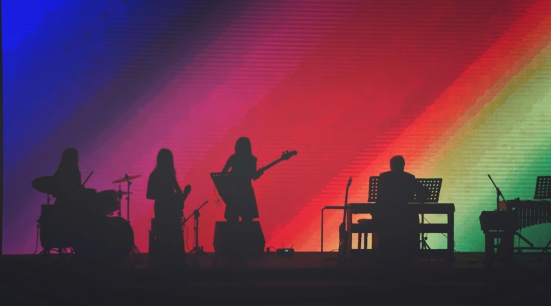
Merch and Live Shows: Taking the Look Into the Real World
Beyond the screen, merchandise and live performances carry a creator’s visual identity into physical spaces. A tour poster, a branded hoodie, or a stage backdrop designed with intention reinforces the same aesthetic that a listener first noticed on a streaming thumbnail. These touchpoints transform passive listeners into visible fans who carry the identity with them.
The Throughline: Match the Sound and the Story
What ties all of these elements together is alignment with the creator’s sound and story. A polished look that contradicts the music feels hollow. The most effective visual identities do not just look good on their own. They feel like a natural extension of what the audience already hears.
Tailoring Visuals for Each Platform
A cohesive visual identity means very little if it looks the same everywhere it appears. Each social media platform has its own format, audience behavior, and content rhythm. What resonates on one channel can fall flat on another, which means independent artists need to think beyond a single asset and adapt their visuals to fit each space.
Research shows that over 60% of music discovery now happens through social media platforms, making platform-native visuals a direct factor in whether new listeners ever find the music at all.
Instagram: Build a Look People Recognize
Instagram rewards curation. A well-planned grid with a cohesive color story gives visitors an immediate sense of who the artist is. Profile aesthetics, story highlights, and post consistency all work together to create a visual signature that encourages followers to stay and explore.
TikTok: Prioritize Energy Over Polish
TikTok operates on a completely different wavelength. Polished design often underperforms compared to raw, motion-driven content with bold text overlays and quick cuts. Audiences on TikTok respond to authenticity and energy, so the visual approach should feel spontaneous rather than overly produced.
YouTube: Thumbnails Are the First Hook
YouTube adds another layer to consider. The video itself is only part of the equation. Thumbnail strategy plays a major role in whether someone clicks at all. High-contrast imagery, readable text, and expressive faces tend to outperform generic stills, making the thumbnail almost as important as the content behind it.
Spotify and Streaming: Reinforce Familiarity Quietly
On Spotify and other streaming platforms, visual engagement takes a more passive form. Album artwork, artist banners, and canvas loops all shape how listeners experience music while browsing or listening. These visuals do not compete for attention in the same way, but they quietly reinforce recognition over time.
The Big Takeaway: Adapt, Do Not Copy and Paste
Given how much discovery happens through social channels, repurposing a single image across every platform without adjusting format, tone, or context dilutes impact. Each channel offers a unique opportunity for fan engagement, and the creators who adapt their visuals accordingly tend to reach further.
Staying Cohesive on a Limited Budget
Not every independent artist has a design team or a dedicated creative budget, but that does not mean visual branding has to feel scattered. A few intentional decisions early on can prevent the kind of visual drift that makes each release look like it came from a different project entirely.
The simplest starting point is a basic style guide. It does not need to be elaborate. A short document listing two or three core colors with hex codes, one or two fonts, and a few rules for logo placement gives every future design decision a reference point. When the same palette and typography carry across singles, EPs, and full album campaigns, listeners begin to recognize the work before they even read the artist’s name. That kind of brand consistency compounds over time.
For creators working without professional design skills, template-based platforms and AI-powered image generators have lowered the barrier considerably. These tools make it possible to produce polished cover art, social assets, and promotional graphics that hold up alongside major-label releases. Paired with modern creative tools for written and visual content, independent artists can expand their production capabilities and build a full creative presence without outsourcing.
Batching is another practical habit worth adopting. Rather than designing assets one at a time as deadlines approach, setting aside a single session to create all visuals for a release cycle keeps everything aligned. The result feels intentional rather than improvised.
Finally, not every touchpoint needs equal attention. Focusing on the two or three channels where the most listeners actually engage ensures limited time and budget go where they matter most.
Visuals Are Part of the Music Now
Visual communication is not a promotional layer placed on top of the music. It is part of how the music lands, how it gets remembered, and how it builds meaning over time.
The creators who treat visuals as an extension of their artistic practice, rather than an afterthought, tend to build deeper and longer-lasting fan engagement. Consistency, platform awareness, and authenticity carry more weight than any production budget. A well-chosen color, a recurring visual motif, or a thoughtfully designed thumbnail can stay with a listener long after the song ends.