

How to Design a Great Challenge Coin
A challenge coin is one of the hardest small formats to design. You get about 2 inches of round metal. There is no scroll, no second screen, and no hover state. Every choice has to earn its place on that disc.
Alt text: A designer sketching a round challenge coin concept on paper
That constraint is why coin design rewards clear thinking. A studio like Challenge Coins 4 Less turns logos and ideas into struck metal for military units, agencies, and brands. The best results start with strong design, not with production. This guide walks through the visual principles that make a coin read, mean something, and last.
Why a Great Coin Starts With Design
A coin has to work as a single, unified image. It carries an identity in the palm of a hand. Poor layout reads as clutter the moment it is struck. Good layout still reads clean from arm’s length. The design does the heavy lifting long before the metal does.
Coins also communicate without a caption. A symbol has to speak on its own, much like how visual elements communicate beyond words. That is the real design brief for a coin. Say who this is for, and say it in one glance.
What Makes a Coin Legible at a Small Size?
Legibility is the first test any coin has to pass. Fine lines vanish once art shrinks to 1.75 inches. Thin text fills with plating and turns to mud. Bold shapes and thick strokes survive that scale far better.
The Interaction Design Foundation frames small-format work as a problem of clarity. Cut any detail that does not help the reading. Keep text short, around 3 to 5 words per line. A coin that fails up close will fail from across a room.
How Does Visual Hierarchy Guide the Eye?
Visual hierarchy is the order in which elements get noticed. On a coin, one hero element should win first. That is usually the emblem, crest, or central mark. Everything else supports it in a clear second and third tier.
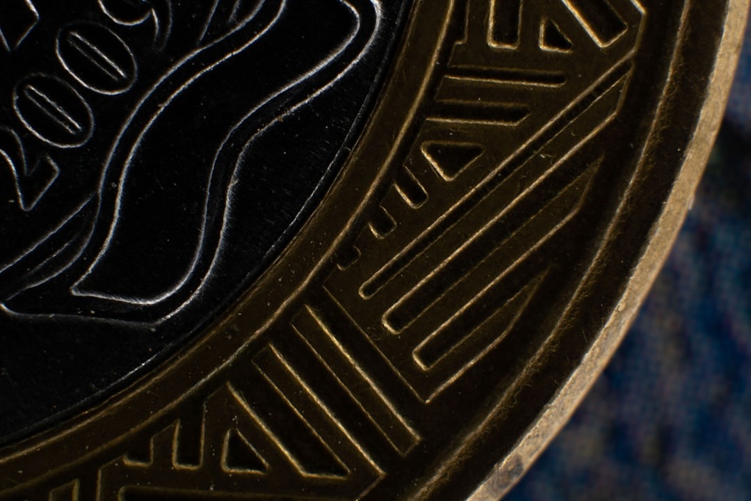
Photo by Ian Talmacs on Unsplash
Alt text: A close-up of an engraved metal coin showing raised relief detail
The Nielsen Norman Group has mapped how size and contrast steer attention. The same rules apply to a round 2 inch canvas. Lead with the symbol, then the name, then the year or motto.
A solid grasp of visual hierarchy helps you rank each part of the coin. Give the main mark the most space and the boldest relief. Push any supporting text out to the quieter outer ring.
Which Color and Plating Choices Hold Up?
Color on a coin comes from two sources at once. Plating sets the base metal tone, and enamel fills the recesses. Together they define the whole mood of the piece. A restrained palette almost always reads stronger than a loud one.
Limit the design to 2 or 3 enamel colors when you can. Pull those colors straight from the existing brand. Match the plating to the message you want. Gold and antique finishes feel formal, while polished silver feels clean and modern.
Common plating options each set a different tone:
- Polished gold for a formal, high-honor feel.
- Polished silver for a clean, modern look.
- Antique bronze for a classic, heritage style.
- Black nickel for a bold, high-contrast finish.
How Do Shape and Edge Add Meaning?
Shape is a design tool that most coin briefs ignore. A circle reads as classic and neutral. A shield, badge, or custom cut can echo the group itself. The outline is the first thing the eye registers.
The edge adds a final layer of craft. A rope, beveled, or oblique-cut rim frames the art. It also signals quality before anyone reads a word. Small choices at the border lift the whole design.
How to Brief a Designer or Manufacturer
A clear brief protects both the design and the budget. It tells the maker what matters and what to protect. Vague requests lead to weak proofs and slow revisions. A tight brief gets you a strong first draft.
Bring these details to your first conversation:
- The purpose of the coin and who receives it.
- Vector logo files, not low-resolution screenshots.
- Two or three exact brand colors with codes.
- A size target, usually 1.5 to 2 inches across.
- Any required text, kept as short as possible.
Key Points for Designing a Challenge Coin
- Design for a small round format from the very first sketch.
- Lead with one hero symbol and support it with a clear hierarchy.
- Keep text short so it survives plating and reduction.
- Limit the palette to 2 or 3 colors pulled from the brand.
- Use shape and edge as design tools, not afterthoughts.
Designing a Coin People Want to Keep
A great coin does one thing with total clarity. It turns an identity into an object people carry. That only happens when design leads the process. The metal simply records the decisions you already made.
Treat the coin like any serious visual project. Sketch, rank the elements, and cut the clutter. Test the art small before you approve a die. A coin built that way earns a permanent spot in a pocket.
Frequently Asked Questions
What Makes a Challenge Coin Design Effective?
An effective coin design is a clear image built for a small format. It leads with one strong symbol and a short line of text. The hierarchy tells the eye what to read first. Every element survives when the art is reduced.
How Small Can Coin Text Be?
Text should stay large enough to read at 1.75 inches. Thin or tiny type fills with enamel and blurs. Keep lines to about 3 to 5 words each. When in doubt, cut words before you shrink them.
How Many Colors Should a Coin Use?
Most strong coins use 2 or 3 enamel colors. A tight palette reads cleaner and strikes better. Pull the colors from the brand you are representing. More colors rarely improve the final result.
What Files Should I Send a Coin Maker?
Send vector logo files whenever you can. Include exact color codes and a size target. Add a short note on the purpose and audience. Clear files lead to a faster, sharper proof.