
How Better Visual Hierarchy Can Turn Casual Visitors Into Interested Customers
Visual hierarchy is designed to reduce the effort required to understand your content. This isn’t just about creating a visually appealing page. This is about ensuring each piece of content on a given page flows naturally, so a visitor can see where they are, what is most relevant to them, and what actions to take based on the content. Your visitor doesn’t always leave because they aren’t interested. Sometimes, visitors don’t stay because the content is difficult to navigate.
You’re not controlling every thought; you are creating a path for their attention.
In addition to telling your visitors what you offer, you should also explain why it is relevant to them. Once they’ve done this, they’ll be able to determine whether or not they want to continue reading, clicking, calling, scheduling a visit, etc. If there’s no clear place to begin, then the visitor will create their own. Unfortunately, this is often a random, incomplete review of your content. More importantly, this typically leads the visitor to leave before your business has a fair opportunity to engage.
Reducing The Effort Required To Understand Content
Visual hierarchy is not about making your page look polished. It’s about providing the least amount of effort required to get your visitors to the desired outcome.
Consider a menu. If every item is listed in the same font, font weight, and line height, it can become tiresome to review. However, if items are separated into logical sections, special items are clearly marked, and prices are easily compared, the consumer can make an informed decision.
Your website provides a similar experience. While your visitor may be familiar with your company, they may still be researching and evaluating several companies. As such, your visitor will likely be experiencing distractions, fatigue, and possibly multitasking. By establishing a clear hierarchy, you provide respect to these factors.
Headings should be larger than normal for major topics. Body copy should be readable. Similar information should be grouped. There should be enough “white space” on the Page so that elements have Room to exist. Buttons should be prominent and easy to locate; however, they shouldn’t distract from all the other elements on the Page.
While Search Engine Optimization (SEO) will assist in finding your page via search engines, visual hierarchy will help your visitor understand the content of that page.
Establish A Prioritized Order For Each Section Of A Page
There is a common misconception that all areas of a page should have equal importance. In most cases, this comes from well-meaning intent. You want your visitor to see your services, reviews, history, contact info, promotions, and recent updates. However, when everything is competing for attention, nothing really stands out.
Before you design or revise a web page, consider what area of the page is going to be most important to the visitor at that time? On a home page, they may need a rapid overview of who you serve and how. On a service page, they may require detailed descriptions of your services, trust indicators, and a clear mechanism for requesting additional information. On a contact page, you may need to provide a way for visitors to contact you without overwhelming them. This does not mean you remove necessary information. It means you present it in an organized manner.
You wouldn’t meet someone new by listing all aspects of your business in one breath. Instead, you’d identify the first thing that would be important to them and provide that information. Then you’d provide supporting information depending upon their level of interest.
Buttons Shouldn’t Be Overly Obvious
A call-to-action button should never feel like a trapdoor. Instead, it should feel like the next logical step.
Placement plays a big role in determining whether the button feels premature. If a button is placed before the visitor understands the offering or promotion, they may feel rushed into something. Conversely, if a button is located too far away from the supporting information, it may go unnoticed. Typically, the best placement for buttons is immediately after a clear explanation of an offer/promotion or after a trust-based section of content.
In terms of button wording, simple, direct language generally performs much better than ambiguous instructions. Using phrases like “get a quote,” “services overview,” or “schedule an appointment” clearly states what will happen as a result of taking the requested action. This reduces hesitancy.
Additionally, you do not necessarily need five separate buttons within a single location. Providing visitors with too many choices slows down their ability to complete an action. Generally speaking, a single primary action coupled with an optional second choice provides sufficient alternatives.
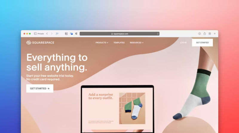
Images Help Visitors Understand The Content
Because images draw attention faster than any other element on a web page, images can significantly aid in visual hierarchy. Images can be used to convey concepts related to your offerings/ideas/products/services to support the content around them. Conversely, poor-quality images can detract from the overall perception of the page and confuse.
Select images that support the content they appear with. If you are illustrating a process, include an illustration of that process. If you are attempting to establish credibility, illustrate that as well (i.e., photos of employees, products, etc.). Icons should be used consistently and kept as simple as possible. The ultimate objective behind selecting images is to provide clarity around your message(s).
Visitors Will Trust A Well-Designed Site More Than One That Lacks Clarity
Although people may not consciously recognize good spacing between elements on a page, consistent headings throughout the site, and clean alignments between elements on the page (or lack thereof), they certainly perceive the differences. A well-designed page (one that follows good hierarchy) tends to feel more trustworthy than one that lacks clear organization.
As stated earlier, multiple design considerations contribute to the feeling of trustworthiness. Consistent typography across the site should be maintained. Long blocks of text should be avoided wherever possible.
Well-Designed Pages Provide Enough Space For Visitors To Make Decisions
By improving visual hierarchy, you are not forcing visitors into becoming customers. What you are doing is providing visitors with enough clarity to engage.
While this might seem like a lower bar for engagement, it is actually very effective. Most visitors do not arrive prepared to commit when they visit your website. Rather, they are curious, unsure, or only partially aware of what they need. Therefore, your website should help visitors transition from confusion to clarity.
Via Unsplash
With proper hierarchy, clearer definitions emerge regarding readability, as well as an increased sense of clarity about subsequent steps. Ultimately, a design that complements the messaging creates an atmosphere of calm on your website, which may turn an otherwise cursory browse into an inquiry.