
Blurry Images Weaken Your Message: How to Upscale Them Cleanly
A blurry image rarely gets noticed for what it is. Viewers don’t think “that photo is 600 pixels wide.” They think the company looks a little careless, the event looks a little cheap, or the slide deck was thrown together the night before. When the only version of a picture you have is too small or too soft, you can often upscale image resolution with an AI model and get something usable, but the result depends heavily on what kind of damage you are starting with and where the picture will end up. This guide walks through both questions, because a clean upscale starts long before you press the button.
Why a Soft Image Costs You More Than It Seems
In visual communication, an image does its job in the first second or two. Before anyone reads your headline, they have already formed an impression from the photo above it. Sharp edges, readable details and clean textures signal care. Smudgy edges signal the opposite, even to people who couldn’t explain why.
Think about a nonprofit’s donation page with a fuzzy photo of volunteers. The mission is real and the people are real, but the picture makes the whole page feel less trustworthy. Or a product listing where the stitching on a leather bag is a brown blur. The shopper can’t see the quality, so they assume it isn’t there.
There’s also a practical side. Most screens people use today are high density, which means an image that looked fine on an older monitor gets stretched and softened on a modern phone or laptop. A photo that was “good enough” five years ago may now be the weakest element on the page.
The good news is that a lot of these images can be rescued. The bad news is that not all of them can, and treating every blurry file the same way is how people end up with results that look worse than the original.
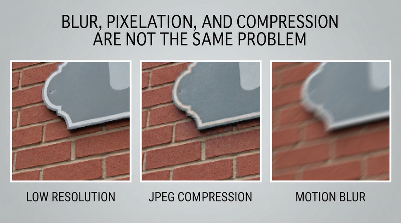
Blur, Pixelation, and Compression Are Not the Same Problem
Before choosing a fix, zoom in and figure out what you’re actually looking at. Three different problems tend to get lumped together under the word “blurry,” and each one responds differently to upscaling.
Low Resolution
This is the most fixable case. The image itself was captured cleanly, it just doesn’t have enough pixels for the size you need. Think of a sharp headshot someone pulled from a video call, or a logo exported for an email signature that now has to go on a banner.
When you enlarge it the old way, by stretching, you see stair-stepped edges and soft mush. Upscaling models are trained precisely for this situation, and they tend to do their best work here.
Compression Damage
Images that have been saved as JPEG several times, or passed through messaging apps and social platforms, pick up a different kind of degradation. Look for blocky squares in flat areas like skies, halos around text, and color banding in gradients.
Upscaling can smooth some of this out, but it can also enlarge the artifacts and make them more obvious. If your tool offers a compression or artifact removal setting, use it, and always hunt for a less compressed copy of the file first.
Optical and Motion Blur
Here the camera never recorded the detail in the first place. Either the focus missed, the subject moved, or the photographer’s hand did. You can tell because edges are smeared in a direction (motion) or uniformly soft everywhere (missed focus), even at the original size.
Upscaling alone won’t solve this. Deblurring and sharpening tools can sometimes help with mild cases, but a badly out-of-focus photo will stay a badly out-of-focus photo, just bigger. That’s worth knowing before you promise a client anything.
What Upscaling Can Recover, and What It Only Imitates
Traditional resizing methods, like bicubic interpolation, calculate new pixels by averaging their neighbors. The image gets larger but not more detailed, which is why the edges look soft.
AI upscaling works differently. The model has learned, from huge numbers of image pairs, what high-resolution versions of low-resolution patterns usually look like. When it enlarges your file, it predicts plausible detail: the texture of brick, the fibers in a sweater, the sharp boundary between a letter and its background.
That word “plausible” matters. The model isn’t uncovering hidden information. It’s making an educated guess. For a landscape or a stock photo, a good guess is all you need, and nobody will ever know the leaves on a tree are slightly different from the real ones.
For other images, the guess can cause trouble. Small text can turn into convincing gibberish. A face in a crowd may get features that don’t belong to the actual person. A serial number on a product label might come out crisp and wrong. So the rule of thumb is simple: the more the exact details carry meaning, the more carefully you should check the output against the original.
A Two-Minute Test Before You Commit
If you’re unsure whether a file is worth rescuing, run a quick trial before building it into a layout. Pick the most demanding part of the picture, usually a face, a hand or a patch of text, and upscale the whole image at the scale you actually need. Then place the result in a rough mockup at its real display size and look at it from a normal viewing distance.
Ask yourself two things. Does it hold up at the size people will see it? And does anything look different from the original in a way that changes the meaning? If the answer to the first is yes and the second is no, go ahead. If not, you’ve learned that in two minutes rather than after a client review, and you still have time to request a new photo, reshoot, or choose a different image for that spot.
This test also helps when you have several candidate photos for the same slot. The one that looks best at thumbnail size isn’t always the one that upscales best. A slightly less striking image with clean edges will often beat a dramatic one that was badly compressed.
How to Upscale an Image Cleanly
A tidy workflow prevents most of the problems people blame on the tools. It doesn’t take long, and it saves you from re-doing work later.
Start From the Best Source You Can Find
Every round of saving, screenshotting or downloading from social media strips out information. Before you upscale anything, ask whether a better version exists. The photographer may still have the original. The client’s marketing team might have a press kit. Even a slightly larger copy from an old newsletter beats a thumbnail from a search result.
If you only have a screenshot, take it at the largest zoom level the screen allows, and save it as PNG rather than JPEG so you don’t add another layer of compression.
Pick a Scale Factor Based on Where the Image Will Live
Work backward from the final size. Measure the space in your layout, then figure out how many pixels it needs. For screens, plan for roughly twice the display size, so a 600-pixel-wide slot on a web page wants a file around 1,200 pixels wide to look crisp on high-density displays.
If the source is 400 pixels wide, a 2x upscale gets you most of the way there and a 4x upscale gives you room to crop. Going higher than you need doesn’t add quality. It mostly adds file size and gives the model more chances to invent things.
Print is its own topic, with its own math around pixels per inch, so if your image is headed to a press, plan the target dimensions for that output specifically.
Crop After, Not Before
It feels logical to cut away everything you don’t need and upscale only the important part. In practice, the model often does better with more context, because surrounding areas help it understand textures, lighting and edges. Upscale the full frame, then crop.
The exception is when the important subject is tiny within a huge frame. In that case, a generous crop around the subject, with a margin, is a reasonable compromise.
Inspect the Result at 100 Percent
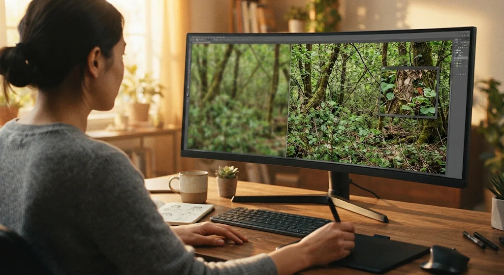
An upscaled image almost always looks impressive when it’s shrunk down to fit your screen. That view hides the problems. Open the file at actual size and scan it the way an editor would: eyes and teeth in portraits, hair against the background, any text or numbers, straight lines on buildings, and repeating patterns like fabric or tiles.
Compare side by side with the original, enlarged to the same size with simple resizing. If the AI version adds detail that looks natural and doesn’t contradict anything in the source, you’re in good shape. If it adds a strange texture to skin, a shimmer on flat surfaces or letters that weren’t there, try a gentler setting or a smaller scale factor.
Finish With Light Touches
Most upscales benefit from small adjustments afterward: a bit of contrast, a touch of sharpening if the result feels slightly flat, maybe a tiny amount of grain to make a very smooth image feel photographic again. Keep each adjustment modest. Upscaled files can tip into the overprocessed look quickly, and once a viewer notices it, they stop trusting the image.
Export once, in the format the destination needs. WebP or high-quality JPEG for websites, PNG for graphics with sharp edges and flat colors, and whatever your printer requests for print.
Matching the Fix to the Job

The same image might need different handling depending on where it’s going, because each format has its own viewing distance and its own tolerance for flaws.
Website hero images are seen large and up close on desktop, then small on phones. They need the most resolution and the most careful inspection, since they shape the first impression of the whole page.
Presentation slides get projected or shared on large screens, where softness shows up fast. A moderately upscaled photo usually works fine here, but avoid enlarging charts or screenshots with text. Recreate them instead, because the text will almost always look better rebuilt than reconstructed.
Social media posts get recompressed by the platform no matter what you upload. A clean upscale helps the image survive that compression with more detail left over, but there’s little point in uploading something far larger than the platform displays.
Logos and icons are usually better served by a vector version than by any upscaler. If the original vector file truly doesn’t exist, upscaling can produce a decent raster version, but plan to have the logo redrawn properly when budget allows.
Product photos carry promises. If the image shows texture, finish or labeling, the upscaled version must still represent the real item. Customers who receive something that doesn’t match the picture tend to remember it.
Email newsletters are viewed mostly on phones and often with images loading at modest sizes, so they’re forgiving. Still, a soft banner at the top of an email sets the tone for everything under it, and since many email clients scale images down rather than up, a modest upscale to twice the display width is usually plenty.
Old family or archive photos are where AI tools can feel almost magical, and also where they take the most liberties with faces. For anything with historical or personal value, keep the original file untouched and treat the upscaled version as an interpretation, not a replacement.
Mistakes That Make Upscaled Images Look Fake
A few habits reliably produce that plastic, overcooked look people associate with AI processing.
The first is stacking tools. Running a photo through a sharpener, then an upscaler, then a face enhancer, then another sharpener compounds every artifact along the way. Choose one main step, and do it well.
The second is chasing the biggest number. An 8x upscale of a tiny thumbnail asks the model to invent almost everything. The output might look detailed at first glance, but it rarely survives close inspection. Smaller jumps from better sources win nearly every time.
The third is ignoring faces. Viewers are extremely sensitive to anything odd in a human face, so even a slight change in the shape of an eye or a too-smooth cheek can make a picture feel uncanny. If faces matter, use settings designed for portraits or keep enhancement subtle.
The fourth is trusting the preview. Small preview windows flatter everything. The flaws show up at full size, on a different device, or in print.
And finally, forgetting about rights and privacy. Upscaling an image doesn’t change who owns it, so a low-resolution photo you don’t have permission to use is still off-limits once it’s large and sharp. If the image includes clients, children or confidential material, read how the tool you’re using stores and handles uploads before sending it off.
Keeping Images Sharp Before They Need Rescuing
Upscaling is a great safety net, but the cleaner your files are from the start, the less you’ll need it.
Ask for originals. When you collect photos from colleagues or clients, request the files straight from the camera or phone, not ones sent through chat apps, which often shrink and compress them by default. A shared cloud folder is usually a safer route than email attachments, too.
Keep a master copy. Store full-resolution versions of key images somewhere central, and export smaller versions for each use. When a new campaign needs a larger size, you go back to the master instead of enlarging last year’s web thumbnail.
Name and organize files clearly. A folder labeled with dates and project names makes it far easier to find the best version later, instead of grabbing whatever turns up first in a search.
Shoot with flexibility in mind. If you know a photo might be used for a banner, a slide and a social post, frame it a little wider than feels natural. That extra space lets you crop for different formats without running short on pixels.
None of this is complicated, and it changes how your work comes across. When every image on a page is crisp, nobody comments on it. The photos simply do their job, and the message gets the attention instead.